

Welcome to the e-Book Cover Design Awards. This edition is for submissions during January, 2017.
This month we received:
88 covers in the Fiction category
26 covers in the Nonfiction category
Comments, Award Winners, and Gold Stars
I’ve added comments (JF: ) to many of the entries, but not all. Remember that the aim of these posts is educational, and by submitting you are inviting comments, commendations, and constructive criticism.
Thanks to everyone who participated. I hope you enjoy these as much as I did. Please leave a comment to let me know which are your favorites or, if you disagree, let me know why.
Although there is only winner in each category, other covers that were considered for the award or which stood out in some exemplary way, are indicated with a gold star: ★
Award winners and Gold-Starred covers also win the right to display our badges on their websites, so don’t forget to get your badge to get a little more attention for the work you’ve put into your book.
Also please note that we are now linking winning covers to their sales page on Amazon or Smashwords.
Now, without any further ado, here are the winners of this month’s e-Book Cover Design Awards.

e-Book Cover Design Award Winner for January 2017 in Fiction
Greg Simanson submitted After Day One designed by Greg Simanson.
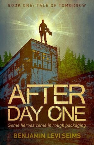

JF: A terrific design expertly executed, this cover delivers big time on the promise of an exciting story set in a dystopian future. The upward-looking perspective, the isolation of the hero, and the overall color scheme help to accentuate what’s of interest.
e-Book Cover Design Award Winner for January 2017 in Nonfiction
Chris Lascelles submitted Through the Darkness designed by Maurizo Marotta.


JF: Spot on. The painting places us in the time frame of medical exploration, and the terror of the scene tells us all we want to know about what’s inside. Combined with some classic typography, a real winner.
Fiction Covers
A.M. Albaugh submitted Grim Nora and the Secret of the Skull designed by Alaina Albaugh. “The cover design includes a simple layout with the main object of the story, the skull-shaped pocket watch, given to Nora by her deceased father.”

JF: Strong and interesting illustration, but the typography doesn’t match up well and weakens the cover.
Aimee Downing submitted Into The Air designed by A. K. Downing. “The cover shows the juxtaposition of the novel’s two opposing worlds: underground compounds and above-ground communities. The title is a reflection, enabling the cover to be read when flipped. Orange highlights included in the monochrome blue and green palette suggest there is life in both worlds.”

JF: It works, and the colors create a strong atmosphere.
Alexandra Brandt submitted A Simple Love Story designed by Alexandra Brandt. “I designed this cover for my friend’s short literary contemporary fantasy; the main elements are the symbols of the two main characters (moon with Celtic knots, magnolia tree) and the setting of Venice. I tried to represent those elements in a way that hinted at the literary tone of the story.”

JF: A beautifully balanced cover with sensitive typography. The textured background holds it all together.
Alexandra Brandt submitted The Grey Stride designed by Alexandra Brandt. “I designed this cover for my friend’s dark cyberpunk story set in their dystopian sci-fi universe, so it matches the branding of their other stories, but with what I hope is a more cyberpunk vibe.”

JF: The strong and conflicting shapes make it hard to “read” the intent of the illustration.
Alexandrea Weis submitted Blackwell designed by Sam Shearon. “This was a hand drawn cover made to depict of the main character in the book.”

JF: Attractive, but I would have liked to see his face more clearly, since that’s primarily what we will respond to.
Amelia Smith submitted The Defenders’ Apprentice designed by Amelia Smith. “Book 1 of an epic fantasy trilogy.”

JF: A good approach for an author/designer. The symbols suggest the kind of story, where an illustration would show the story, but the simple approach pays off in this series.
Amelia Smith submitted The Turncoat Prince designed by Amelia Smith. “Book 2 of an epic fantasy trilogy.”

Amelia Smith submitted Chronicles of the Last Days designed by Amelia Smith. “This is the final book of a series/trilogy of epic fantasy novels. I’m submitting the other two in the trilogy this month as well, to show them all together.”

Andreea Dumez submitted Smile with My Animal Friends designed by Andreea Dumez. “I wanted to create a dynamic and humorous composition that ultimately focuses on the title. I played with the idea of leaving the eye wander around the circular tentacle, and added a few characters that point towards the title. I used Watercolors, Colored Pencils, Adobe InDesign, Adobe Photoshop.”

JF: Although some of the illustrations have charm, the design fails as a book cover, and your aim of focusing on the title won’t work because we can hardly read it.
Annelie Wendeberg submitted Keeper of Pleas designed by Annelie Wendeberg. “A Victorian mystery”

JF: Nice image compositing, although the title is being overpowered by the very active background.
Annemarie Musawale submitted The Swamp is Full of Mystery designed by Annemarie Musawale. “Hi. This is my second book out and I really love the cover. I hope you love it too.”

JF: No, sadly, I don’t love the cover, and I don’t see much appeal to readers either. It looks like what it is: an amateur’s attempt at a book cover. Nothing wrong with that, depending on what you were aiming for.
Brandon Zenner submitted The After War – The Complete Novel designed by James, Humble Nation. “Hello, Thank you for considering The After War. The image on the cover of a compass burning is a combination of the two covers used for Parts I and II. Part I is a compass, Part II is fire. All the best, Brandon Zenner”

JF: The concept could work, but the font choices seem a bit schizophrenic. You’ve got at least three different kinds of typefaces on the one cover.
Cindy Hiday submitted Father, Son & Grace designed by Jack Hiday. “Ray Colton has had his fill of flat land. His one goal when he takes his son on a road trip is to keep heading west until he reaches his native Oregon.”

JF: There’s a reason professional cover designers are professionals, and this cover doesn’t show any trace of professionalism.
Dan Van Oss submitted The Pretty Ones designed by Dan Van Oss.

JF: A solid genre cover that plays effectively with the two images, one looking at us, one drawing us in through the broken window.
Dane Low submitted Dawn of Legaia designed by Dane at CreativIndieCovers.com.

JF: A beautiful and intriguing cover, and note how carefully the type is integrated into the design. ★
Dane Low submitted That One Kid Who Freaked Out, Or Whatever designed by EbookLaunch.com.

JF: I like the idea and composition for this gay novel, but some of the elements lack contrast.
Dane Low submitted My Heart’s Obsession designed by EbookLaunch.com.

JF: Careful typography, not sure about the disembodied hand(s).
Dane Low submitted The Folcroft Ghosts designed by EbookLaunch.com.

JF: A nearly perfect cover with atmosphere, story, a clear signal about the kind of tale inside, and a lot of care taken in putting it together, with some delightful type details, too. ★
Dane Low submitted A Beggar’s Lament designed by EbookLaunch.com.

JF: A strong graphic cover for this satire. This style will really stand out, no matter how small the cover is displayed.
Dane Low submitted Mother designed by EbookLaunch.com.

JF: Here the designer forcefully focuses us on the message he wants to send about the book and its story.
Dane Low submitted Worst. Superhero. Ever.: and other odd short stories designed by Ebook Launch.com.

JF: Fun, and the strongly contrasting blue and red make it stand out.
Daniela Morescalchi submitted The last Flag designed by agileArt. “For a thriller horror fiction series. Created by agileArt with Blender/Photoshop/Illustrator.”

JF: I find it visually confusing. Is the red panel supposed to be the “last flag”?
Darja DDD submitted Bad Spirits designed by Kitten from Deranged Doctor Design. “Book cover design for Thriller, Mystery, Kate Jones Thriller Book 1”

JF: There’s no mistaking the kind of story or the setting in which it takes place from these strong series covers, and the bullets around the author’s name add to the excitement.
Darja DDD submitted Cruising for Death designed by Kitten from Deranged Doctor Design. “Book cover design for Thriller, Mystery, Kate Jones Thriller Book 5”

Darja DDD submitted A One Way Ticket to Dead designed by Kitten from Deranged Doctor Design. “Book cover design for Thriller, Mystery, Kate Jones Thriller Book 7”

Darja DDD submitted Enemy Inside designed by Marushka from Deranged Doctor Design. “Romance, New Adult cover design, The Captive Series Book 1”

JF: Another strong series design. This one has clever branding embedded in the title element, and the background images are treated almost as a texture, dramatizing the contrast with the small figure of the woman. Well done. ★
Darja DDD submitted Depravity designed by Marushka from Deranged Doctor Design. “Romance, New Adult cover design, The Captive Series Book 2”

Darja DDD submitted Obsidian Son designed by Milo from Deranged Doctor Design. “Science Fiction & Fantasy, Superheroes, Mythology cover design, A Novel In The Nate Temple Supernatural Thriller Series, Book 1”

JF: This series successfully portrays the protagonist in the midst of the supernatural action with clear signs about the nature of the genre.
Darja DDD submitted Silver Tongue designed by Milo from Deranged Doctor Design. “Science Fiction & Fantasy, Superheroes, Mythology cover design, A Novel In The Nate Temple Supernatural Thriller Series, Book 4”

Darja DDD submitted Stone and Spark designed by Kitten from Deranged Doctor Design. “Mystery, Thriller & Suspense cover design, Book 1 in the Raleigh Harmon mysteries”

JF: Great compositional idea for a series design that focuses on the woman’s figure in different settings and relies on color shifts from one cover to another to differentiate the individual titles. But I’m really not a fan of the style of font used for the titles, it weakens the overall effect.
Darja DDD submitted Stone and Snow designed by Kitten from Deranged Doctor Design. “Mystery, Thriller & Suspense cover design, Book 2 in the Raleigh Harmon mysteries”

Darja DDD submitted Stone and Sand designed by Kitten from Deranged Doctor Design. “Mystery, Thriller & Suspense cover design, Book 3 in the Raleigh Harmon mysteries”

Deborah Coonts submitted After Me designed by Damonza.

Deborah Gray submitted The Water Kingdom designed by Laura Gordon. “”The Water Kingdom” is a young adult fantasy written in dual first person, involving the discovery of a hidden world beyond the waves. This cover was selected to relay the feeling of wonder and the fantastical elements of what this watery realm may entail.”

JF: The surreal nature of the imagery is attractive, but the typography is weak and lacks impact.
Emily Stillings submitted The Crying Bird designed by E.J. Stillings. “This is a Women’s Literary Fiction story about a grieving woman who bonds with a Limpkin bird in Florida. Limpkins are also known as “Crying Birds”. In this story, the sweet sadness of the main character’s grief is balanced with humor and hope.”

JF: A decent job, and I like the clean look of this cover, but I can’t help but think there were other ways to arrange these elements that would have yielded a better, more integrated design. As it is they seem haphazardly placed.
Gordon A Long submitted Zoysana”s Choice designed by Mihaela Voicu. “The entry point to a 7-book saga”

H. Leighton Dickson submitted Dragon of Ash & Stars designed by H. Leighton Dickson. “Thank you!”

JF: Strong fantasy cover with a simple but direct design.
H.N. Klett submitted Pirate Queen: Book of the Navigator designed by M. Wayne Miller.

JF: Looks just right for this mix of piracy and fantasy.
Harald Johnson submitted 1612 designed by Harald Johnson. “For Book 2 of my series, I only changed the main title and the treatment of the “virgin Manhattan” background image. In addition to a change of overall hue, I wanted a more distressed look with more tension, which ties into the increasing conflicts in the story.”

JF: Intriguing, and for anyone who recognizes the shape of lower Manhattan, the appearance of the island as heavily wooded will spark interest in the story.
J New submitted An Accidental Murder designed by JC Clarke at The Graphics Shed. “The first in series, a 1930’s British Vintage Murder Mystery. I wanted something evocative of the Golden age of Mysteries, with a modern element in the form of the cat, who features heavily in the story.”

JF: Although I like the 30s look, both of these covers suffer from the same problems: too much detail for the murky lighting to adequately show, and the weak title treatment.
J New submitted The Curse of Arundel Hall designed by JC Clarke at The Graphics Shed. “This is a 1930’s British Vintage Murder Mystery. The idea was to emulate the Golden Age of Mysteries but with a modern element, namely the cat, which features in the books.”

James Egan submitted Runic Revelation designed by James T. Egan of Bookfly Design.

JF: The embellished title really holds its own against the big, dramatic art that does a good job of drawing us into the story.
James Egan submitted Grave Mistake designed by James T. Egan of Bookfly Design.

JF: The girl’s casual attitude helps contrast with the flame she appears to be holding, and the urban setting features nicely. Along with distinctive title typography, the whole thing comes together well.
James Egan submitted The Fortune Teller’s Daughter designed by James T. Egan of Bookfly Design.

JF: Although the title is expertly handled and contributes a lot to the look of this cover, the image was just too difficult to decipher, at least for me.
Jennifer Wilson submitted New World Rising designed by KimG-Design. “Working with Kim was not only an honor, but a true artist’s adventure. We worked closely, pulling from inspired images and the book’s dark gritty storyline to create a cover that embodies the world encased within. Kim’s design captures Phoenix’s solitary fight to survive in a world of join or die.”

JF: Attractive design that combines images to highlight both the female lead and the environment of the story. ★
Jerri Williams submitted Pay To Play designed by Robert Dieters. “Crime novel about corruption in the Philadelphia strip club industry. Does it work? If yes, can it be tweaked to work better?”

JF: The title needs more contrast with the background and the illustration needlessly minimizes the one thing you want to focus on—the envelope.
Jessica Church submitted Pawn designed by Jessica Church.

JF: Both of these covers (see below) have nice atmospherics and an attractive simplicity that works to their advantage.
Jessica Church submitted Fool’s Game designed by Jessica Church.

Jim Heskett submitted Catch and Release designed by Extended Imagery. “Book 6 in a thriller series, this book focuses on the main character’s time in prison, along with a parallel story that takes place in Dallas”

JF: You may be trying to show *too much* on the cover, and the assortment of images reminds me more of a nonfiction history. Perhaps better to focus on one key action or scene that illuminates the main appeal of the book.
Justine John submitted Gilding The Lily designed by I Am Self-Publishing.

K.A. Finn submitted Ares designed by Dane. “Character illustration by Maroot Thanomluk.”

JF: An attractive series design built around strong illustrations and expert typography, I think the third one is the strongest (“Perses”) because we get to see the character close up and the background, instead of adding detail, focuses us on the hero.
K.A. Finn submitted Nemesis designed by Dane. “Character illustration by Maroot Thanomluk”

K.A. Finn submitted Perses designed by Dane. “Character illustration by Maroot Thanomluk”

JF: As I said above, here the hero is closer to us, and everything else is secondary. Love the illustration style, too. ★
Karen Rosario Ingerslev submitted In Search of Livi Starling designed by Bryn Abbott. “In Search of Livi Starling’ is the first in a four book series. The cover designs of the rest of the series follow a similar theme.”

JF: Designs like this can have charm, but this one doesn’t make much of a statement.
Karl Erickson submitted The Blood Cries Out designed by Kimberly Erickson.

JF: Some nice touches, but there are too many equally weighted images vying for our attention.
Karri Klawiter submitted Echelon designed by Art by Karri.

JF: Classic sci-fi cover.
Kevin Doyle submitted Actually…It’s a Short Story Collection designed by Chris Higgins. “This cover is a collage of many of the unique illustrations inside our book. Chris carefully designed it to intrigue readers by indicating the whimsical topics of the stories. It’s also meant to capitalize on the current popularity of highly-detailed, eye-catching coloring books.”

JF: From a design point of view, dumping a lot of interior illustrations on the cover is an ineffective strategy, and the result is a cover that looks like a sketch for something else.
KK Gould submitted Acceptance designed by KK Gould. “The main character in this series develops the ability to use fire. In this book she learns to trust her mate to stand by her side through her challenges.”

JF: Awkward and unconvincing.
Koffi Hallman submitted Death Of A Thug designed by Nilofr_creative. “there is a character fighting for life behind bars and a man a woman heading in two different directions”

JF: None of which is expressed on this rather dreary cover.
LaAnthonie Hudson submitted Stimulate designed by LaAnthonie Hudson. “This book is amazing and the cover screams Stimulate”

JF: That’s an objective appraisal, right?
Latonya Page-Balkcom submitted Mic-Key, Ms. Penelope & Me designed by Latonya Page-Balkcom.

Maialen Alonso submitted Melodies of Blood I designed by Maialen Alonso.

JF: A bit of a mess. Did you really want to make the type hard to read?
Malcolm Campbell submitted Eulalie and Washerwoman designed by Jack Stollery. “Jack translated my rough idea for the cover into stunning artwork that mirrors his artwork for my “Conjure Woman’s Cat” cover published in 2015.”

JF: It’s odd how similar the layout of this cover is to “Baby Nathan’s Story” above: the panel, the dotted divider, the box for the author’s name. Here the illustration is interesting, but the rest of the cover is formulaic and bland.
Manu Herbstein submitted Akosua and Osman designed by Manu Herbstein. “This is a young adult story set in Ghana. I commissioned the Ghanaian artist Ben Agbee to do the cover image. I added the title and author name.”

JF: You have a terrific and unusual image to work with that will really make this cover stand out, but it’s being held captive by the completely inappropriate title treatment. Best thing you can do with an illustration like this is to get out of its way and let it shine.
Maria Evan submitted In The Land of Broken Time: The Incredible Journey designed by Maria Evan.

Mariah Sinclair submitted Wendy & Peter: A Novel designed by Mariah Sinclair. “Retelling of Peter-Pan with a punk aesthetic. Wendy is drowning in her “real life” until she gets meets mischievous red-headed Pan. While the design is a nod to punk, I wanted to hint at the dark circus of Neverland and include subtle elements from the original story: tinkerbell, hook, alligator.”

JF: I like the overall aesthtic, but there’s an awful lot going on here, and it does look like that monkey skull is chomping on Wendy’s head. And what’s with the big safety pins?
Mikhaeyla Kopievsky submitted Resistance (Divided Elements #1) designed by Leonardo Gonzalez. “Leo did an amazing job of referencing the inner conflict between the hero’s Air and Fire identities. The title typography is also a nice reflection of the Heterodox graffiti that plays a major role in the story.”
")
JF: Have you noticed that more submitters are writing “critiques” of their own covers? And that these critiques are always positive? This cover is interesting but a bit rough.
Morgan Zeitler submitted Dancing Blind designed by Morgan Zeitler. “I wanted original art on the cover because a pastel plays a central role in the book, and is described in detail therein. The artist, (Erica Fielder Studio) did a fantastic job of bringing a fictional art work, and the book’s theme, to life. Cover text is kept simple to let the art speak.”

JF: Consider the fact that no one considering this cover has read the book yet, and consequently doesn’t know that this image is important to the story. I don’t think browsers will be attracted by the unfinished nature of the art or the very weak title.
Patricia Lillie submitted The Ceiling Man designed by Patricia Lillie.

JF: Evocative cover for a ghost story.
Paul Francois submitted Shadowbane: Age of Aelfborn designed by Paul Francois & Jeff Kimbler.

JF: Good example of giving genre readers what they want, and the hint of menace from the dragon makes it that much better.
PAUL SILBERBERG submitted THE BOOK OF DJINN designed by P.K. SILVERSON.
JF: Amateur cover design, typified by “pasting” one kind of image on top of a completely different and incompatible type of image.

Rebecca Agra submitted Fantasia designed by Rebecca Agra.

JF: A good approach although it might be stronger if the dancer’s foot better matched the tonal value of the title.
Rena Hoberman submitted The Survivors of Bastion designed by Rena Hoberman of Cover Quill.

JF: Vivid, with a neat visual surprise in the flipped bottom image, expressing the theme of the book.
Ronda Gouchie submitted In Plain Sight designed by R. E. Gauthier and Blue Dawg Press. “My cover design depicts the Baltimore Inner harbor night skyline and a rendition on the main character FBI Senior Special Agent Kelsey MacGregor.”

JF: Pretty generic thriller cover.
Ryan Fleming submitted Hail Judeas Caesar designed by Damonza. “The book postulates Roman manipulation of religious forces in Judea (1st century A.D.) for the purpose of softening Jewish resistance, resulting in the inadvertent birth of Christianity.”

JF: A beautifully textured and carefully composed cover sure to appeal to readers of historical fiction on this subject. It has a lush feel that’s hard to resist. ★
S.A. Combs submitted Tapper: A Novel designed by S. A. Combs. “Tapper is the contemplative man on the cover and is an empath—the mix of colors representing the chaotic thoughts and feelings going on in his mind.”

JF: I think the chaos has leaked into the graphics because it’s hard to see a “contemplative” man in this image.
Sarah Wynes submitted Fly Witness designed by Sarah Wynes. “The cover was designed for a children’s book. It IS a different kind of bedtime story which takes place in the woods. The cover design was inspired by a painting purchased by the author. The book has a feel of Dr. Seuss meets Tim Burton, hence the colorful, dark fantasia look and sketchy font.”

JF: The Tim Burton influence is strong, not sure I see a lot of Dr. Seuss, and the title could be fifty percent (or more) larger to better balance the rest of the cover.
Scott Combs submitted The Kili Wanna Affair designed by Scott A. Combs. “This satrical tale takes place on a podunk planet called Kili Wanna and has much to do with junk food corrupting the society there. Hence, the cover includes the sign at Manny’s Hot Dog Emporium, fire—indicative of a foreboding disaster, and one seemingly innocent character atop the sign.”

JF: To be honest, I missed the little character on top of the sign, but the rest is so amusing it really didn’t matter. Nice job creating a cover that doesn’t look like everyone else’s.
Tammy Seidick submitted Last Chance designed by Tammy Seidick. “Thanks for your review!”

JF: Just right for a romantic suspense novel taking place in the tropics.
Tanja G. submitted Vieren schlafen nicht designed by Tanja G..

JF: The title translates as “Viruses do not sleep” and the cover expresses the “threatening virus” motif perfectly.
Tanja G. submitted King of Fools designed by Tanja G..

Tanja G. submitted Totgetäuscht designed by Tanja G..

JF: The knife is a bit heavy handed. Title translates as “Dead Deceived.”
Tanja G. submitted The Red Wolf designed by Tanja G..

JF: Nice type but the image is very confusing.
Tim McConnehey submitted Zafir and the Seventh Scroll designed by Christian Fuenfhausen. “The book is a historical fiction novel. It is the second book in the Bassam Saga. The image captures the adventure that is going on in about 200BC as the main character travels by sea around China coast.”

JF: The image puts us right in the scene, and the layout of the cover is confident and expertly done. ★
Timothy Imhoff submitted Mended Wings: A Flicker’s Tale designed by Peggy Nehmen. “Mended Wings tells the story of a young woman named Flicker and her inspiring journey to independence following a traumatic brain injury.”

JF: Ordinarily I would find the colorful little bird out of sync with the gritty black and white photo, but it does make me want to know more about the story and how these two are related.
Valorie Lord submitted Seven Miles Deep – Chantrea designed by Valorie Lord and Miia Kajaani. “The artist, Miia Kajaani, captured what I envisioned perfectly, not an easy task as all she had to work with was my terrible sketch and some verbal descriptions. I wanted the cover to show a boy in a submarine awed by unexpected rays of light (and their undepicted source) he finds deep in the ocean.”

JF: A captivating illustration, would have liked to see the title have a bit more contrast with the background.
Vero Martinez submitted Saving Her Reputation designed by Vero Martínez. “Ebook cover made with photomanipulation.”

JF: I love the delicacy of this cover, and the way all the elements have exactly the same tone and achieve a beautiful balance.
Nonfiction Covers
Brother Simeon Davis submitted The Christ of India: The Story of Saint Thomas Christianity designed by Brother Simeon Davis. “The cover is a combination of a photograph of a temple in India, stylized in Photoshop, together with a painting of Jesus which I did. The combination of Jesus sitting cross-legged in the eastern style together with the temple hopefully carries across the idea of “The Christ of India””

JF: Due to your careful work, the images integrate nicely and communicate your theme well. Next time you might give the title and subtitle more emphasis, they are equally important. ★
C. Streetlights submitted Tea and Madness designed by Laura Hidalgo. “Cover photography by Lana Dunn of Beautifully Dunn Photography, https://www.beautifullydunn.photography/”

JF: The confident delicacy of this cover attracts, and the title helps it stand out.
Carla Bass submitted Write to Influence! designed by Melissa Stevens. “My only guidance was “something bold and elegant.” I selected a rich blue to reflect my calling to a 30-year Air Force career ”

JF: It feels a bit cramped, and unless you are selling to an Air Force crowd, the color choice is irrelevant. It should be aimed at the intended buyers not to please the author.
Cheryl Denise Chandler submitted Assortments of Grace: A Collection of Poetry designed by Create Space. “This photo was taken by a complete stranger during my first visit at the, Cylburn Arboretum. I so love nature and when I sat down for a rest, this landscaper came over to speak to me. I asked if he would take a picture of me with my phone?”

Chris Lascelles submitted The Pharmacist of Auschwitz designed by Miroslav Smiljanic.

JF: The historical allusion is perfectly apt and well executed.
Dane Low submitted A Year Unplugged designed by EbookLaunch.com.

JF: A very professional cover, but it would have been nice to see some humans, given the topic.
David King submitted Setting Goals to Live Your Life of Freedom designed by David Avoura King. “Stock library photo, text all in Steelfish font”

JF: Basic type-on-photo treatment.
Elena Newton submitted Elevating the Employee Experience designed by E. A. Newton. “The cover is a photo that I took while skiing the Collins run at Alta Ski Resort (Utah), and the author felt captured the concept of an “Elevating Experience”. These are the company’s colors and fonts. The author didn’t want his name to be prominent on the cover so I went with light on snow.”

JF: Above average for an internal document. Otherwise, shows the weakness of being constrained by corporate policies when it comes to book cover design.
Irene Kamara submitted Corridors of dreams and hope designed by Edmond Kamara. “Irene is born in a family of seventeen siblings, into extreme poverty, on a farm in rural Uganda.”

JF: Terrific photo that puts us right in her village, but shame the type and title treatment are so weak by comparison.
Jewel Allen submitted Soapbox designed by Steven Novak.

JF: I love the lighthearted approach to a political memoir, where we would expect to see a rather boring photo of the author. ★
Keith Van Sickle submitted One Sip at a Time: Learning to Live in Provence designed by Teddi Black. “The book is a light memoir of my adventures (and misadventures) in Provence. I think that Teddi beautifully captures the feel of the book, with an image of someone who is obviously from elsewhere but who is trying to fit in. And is having a good time while doing so!”

JF: Delightful.
Kelly Caldwell submitted A Day In The Life designed by Kelly Caldwell.

JF: The sheer impudence of the model combined with the bright color scheme are enough to attract attention. There may be some incongruence since the photo is pretty saucy, and the book appears to be a straight anthology of advice from coaches.
Marion Eaton submitted I Kiss Cold Glass designed by Laura Barber. “A Poetry book. A collection of love poems by three women in the same family, including the handwritten poem shown at the bottom right of the cover.”

JF: A lovely approach, and the “meta” detail of one of the poems appearing on the cover adds to the effect.
Marshall Dotson submitted Actions and Goals: The Story Structure Secret designed by Marshall Dotson. “For my story structure guidebook I wanted something a bit more dynamic than a typewriter. I think the man jumping to a helicopter captures the premise of the title while the slanted angles created by the images and title create dynamism that can be easily read even as a thumbnail.”

JF: Works well. You might get someone to tone down the background a bit, the action will stand out even more.
Melody Christian submitted Work Your Wealth designed by Melody Christian. “You know you’re going to have fun designing a book cover when the author suggests “glitter dollar signs and bright colors.” Together we came up with a modern financial book that appeals to millennials. We went as bright as the printers would allow, and came up with a bold, effective design.”

JF: It works beautifully, and the modern look is refreshing in this category.
Michael Eli Vineberg submitted I’m Human, Now What? (Semi-Precious Thoughts on Life) designed by Miguel Angel De La Rosa Aguiar. “I wanted a basic design that caught the eye and simply conveyed some aspects of what it feels like to be a human being trying to make a go at this thing called life. We worked with font, color, and the balance of hard edges / soft curves. I love the outcome and that it reads easily in thumbnail size”
")
JF: It’s. . . basic.
Mike Emery submitted Growth – Reveal The Hidden Magic of Colouring designed by Mike Emery. “This is the first book I’ve written. It was created from start to finish by myself in two and a half months for $0.05 (the only cost was the pencil crayon stock image). I wanted a simple cover that would stand out and convey the theme of colouring for personal growth.”

JF: My take on it is: with “coloring, mindfulness and inspired action” to work with, why come up with something that looks like a corporate booklet? Where’s the excitement, the action, the “hook”?
Rick Holland submitted Taming the Truant Mind designed by Rick Holland / Vision Press. “A fun, soothing cover for a mindfulness book.”

JF: Couldn’t have said it better. Just looking at this cover has to make you smile, and you’re halfway to mindfulness right there! ★
Robyn Gough submitted Science ala Carte designed by Clikchic Designs. “Mathijs’ gritty and down to earth writing style suits a gritty and down to earth cover.”

JF: A terrific cover whose distressed style looks back to some old models but is very up to the minute. Holds together beautifully, and much better than the other book from the same author below.
Robyn Gough submitted The Non Solutions Process designed by Robyn Gough. “A simple but striking cover designed to accentuate the professional rebuttal of green energy strategy contained within its pages.”

Rudolph Mensah submitted Becoming Your Dream designed by Rudolph Mensah. “We all have dreams and when we believe, and work on it, we can make it possible.”

JF: A great image to work with, and a better title treatment would show it to maximum effect. Here, the typography weakens the cover.
Shay Dawkins submitted iSin: Have Your Cake and Eat It 2.0 designed by Austin Martin. “The cover of a smartphone (iPhone) correlates with the book series, iSin, in that the entire book incorporates a smartphone theme that gives the reader a modern feel of “downloading an app” via “downloading life information” from the read that is relevant and pertinent to any reader’s life.”

JF: Okay, if you say so. Doesn’t look much like a book cover, though.
Sherry Rentschler submitted Breaking the Glass Slipper designed by Cover Me Darling. “Asked my designer to demonstrate the “bad girl” breaking out of the “Cinderella” myth. Live model was used holding real shoes. No stock photography used except background color. I felt it was accurate imagery for my memoir.”

JF: The red glove really makes this cover, conveying a sense of richness and pomp while holding the fragile slipper at the same time, drawing our attention to the theme of the book. ★
Tim McConnehey submitted How to Read the Constitution and Declaration of Independence designed by Christian Fuenfhausen. “In our opinion the cover says what the book is about. It speaks about the founding of America.”

JF: You touched all the bases needed for this book.
William L. McGee submitted MONTANA MEMOIR: The Hardscrabble Years, 1925-1942 designed by Ruth Schwartz. “The cover photo is of the author at age seven (center) branding spring calves on the Holm ranch outside of Malta, Montana, 1935. In the Depression years, young boys or girls were often “farmed out” (as it was called) to work for their room and board “so there was one less mouth to feed at home.”

JF: A cover that’s well put together, with appropriate type choices, although I’m not a fan of big, black panels.
Well, that’s it for this month. I hope you found it interesting, and that you’ll share with other people interested in self-publishing.
Use the share buttons below to Tweet it, Share it on Facebook, Plus-1 it on Google+, Link to it!
Our next awards post will be on March 20, 2017. Deadline for submissions will be February 28, 2017. Don’t miss it! Here are all the links you’ll need:
- The original announcement post
- E-book Cover Design Awards web page
- Click here to submit your e-book cover
- Follow @JFBookman on Twitter for news about the E-book Cover Design Awards
- Check out past e-Book Cover Design award winners on Pinterest
- Subscribe to The Book Designer Blog
- Badge design by Derek Murphy
