Welcome to the e-Book Cover Design Awards. This edition is for submissions during November, 2015.
This month we received:
109 covers in the Fiction category
17 covers in the Nonfiction category
Comments, Award Winners, and Gold Stars
I’ve added comments (JF: ) to many of the entries, but not all. Remember that the aim of these posts is educational, and by submitting you are inviting comments, commendations, and constructive criticism.
Thanks to everyone who participated. I hope you enjoy these as much as I did. Please leave a comment to let me know which are your favorites or, if you disagree, let me know why.
Although there is only winner in each category, other covers that were considered for the award or which stood out in some exemplary way, are indicated with a gold star: ★
Award winners and Gold-Starred covers also win the right to display our badges on their websites, so don’t forget to get your badge to get a little more attention for the work you’ve put into your book.
Also please note that we are now linking winning covers to their sales page on Amazon or Smashwords.
Now, without any further ado, here are the winners of this month’s e-Book Cover Design Awards.
e-Book Cover Design Award Winner for November 2015 in Fiction
Ruby Duvall submitted Eidolon designed by Dane Low. “I asked a lot of Dane, who gave me a sexy, intriguing cover. “Eidolon” is BDSM Romance with sci-fi and horror elements. The best option was to signal romance first, then BDSM (ropes) and robotics (circuitry). Anything more would’ve been too busy. It also looks good as a thumbnail!”


JF: Svelte and moody with the promise of some pretty naughty action. Pregnant with eroticism, almost begging us to just give in and submit to its charms.
e-Book Cover Design Award Winner for November 2015 in Nonfiction
Candiya Mann submitted On Grief, Hope, and Motorcycles: A Diary designed by Pete Garceau. “I found Pete through your design awards, and I love what he created here. It perfectly captures the year after my boyfriend died. His design is alien and raw yet beautiful and feminine. There is a sense of motion as the figure follows the track of light, which I hope mirrors my journey of healing.”

JF: Poetic, elegant, and a bit scary all at the same time. Great use of a stock image, combined with the confident typography, it adds to the effect.
Fiction Covers
Alison Robins submitted Every 39 Minutes designed by Sam Wall

JF: A very good illustration but I’m not sure this works as a cover because it gives us no idea what the book is about and the title and cow have been severely marginalized.
Andrew Clark submitted The Time Store designed by Bespokebookcovers.com. “With the design we needed to include the time travel genre, hence using the clock & dials,then we added the Greenwich, London element, and chose the ORNC as a perfect building for this, finally we needed to capture the Prime Meridian. We liaised closely with our designer throughout the project.”

JF: It paid off, this is a lovely and appropriate cover for your genre.
Anne O’Connell submitted Deep Deceit designed by Graham Booth. “I wanted the cover to convey a noir fiction/suspense novel that takes place in a foreign country with an underlying theme of oppression.”

JF: The image is very strong, but I’m not sure the title font was a good choice.
Anne Roberts submitted The Twisted Diary- Infatuation designed by Scarlett Rugers. “A good wife who tragically becomes a widow finds herself infatuated by a man that charms her with a new lifestyle that she had only dreamt about. A roller coaster ride of socializing which includes excessive wining and dining.”

JF: Looks like a fun read, but the visuals and font changes are getting a bit confused.
Becky Doughty submitted All the Way to Heaven designed by Marya Heiman. “This is a Contemporary New Adult/Coming of Age Romance that takes place in Tuscany, with much of the story surrounding a generations-old olive grove and mill. Because it’s clean, we wanted a completely different look from the typical semi-clothed torsos we see on so many in this genre.”

JF: A beautifully designed and balanced cover, I hope your readers will recognize it for what it is without all those sweaty bodies.
Becky Johnson submitted If I Seem Dangerous designed by Claire Smith. “While IISD has a strong thread of romance, it’s not what drives the story forward. It was important to have the focus on the male MC. It’s his story, about how he overcomes his past and attempts to navigate a new route to move past ‘seeming dangerous.’ This cover successfully captures that essence.”

JF: A strong cover that doesn’t seem to have any whiff of romance.
Brent Thomas submitted Deadly Troubadours designed by Rika Touma. “I wanted something fun and that hinted at adventures with a group of travelers. Something that would strike up memories of the beginning of many a Dungeons and Dragons game. And a wanted something hand drawn without the overly slick, Photoshop look I see on many on many independent fantasy covers.”

JF: I think your “wants” are all on target, but the cover doesn’t satisfy. The visual is far too confusing and difficult to make out, and the title lacks any emphasis.
Brian Kindall submitted Delivering Virtue designed by Kristin Eames.

JF: Inexplicable and incongruous, although I like the title flourishes.
Candi Sary submitted Black Crow White Lie designed by Kerry Ellis. “In the book, a mother lies to her son and gives the illusion that his deceased father was a hero. She claims he could catch a crow with his bare hands. The shadow illusion of a crow speaks to this central story. The image also touches on the boy’s mysterious ability to heal with his hands.”

JF: A clever design, well executed, which utilizes the contrast of black and white to great effect.
Carolyne Aarsen submitted The Only Best Place designed by Erika Brouwer. “I wanted a consistent look over the three books in this series – a woman from the back, entering into the story. My niece designed the covers with input from me and I’m very happy with the results.”

JF: Erika has a good future as a cover designer, and both of these are well thought out, with great “hooks” into the story. The titles need more contrast, however.
Carolyne Aarsen submitted This Place designed by Erika Brouwer. “This is the third book in the Holmes Crossing Series that starts with The Only Best Place, the other book I entered into the competition.”

Catherine Richmond submitted Gilding the Waters designed by Kim Killion. “This inspirational historical romance is set in 1908. We couldn’t find a model with a Gibson girl hairstyle, but this cover said summer in Virginia.”

JF: Lovely, with a simple elegance.
Charles Millhouse submitted Captain Hawklin and the Underwater Menace designed by Charles Davenport. “Our idea behind this cover was to capture the feel of the old pulp adventure series of the 1930’s and 40’s. I think we did that with this cover. Thank you for the consideration.”

JF: I really would have tried to make the title much more prominent.
Christine Church submitted Sands of Time: Fate of the True Vampires designed by Christine Church. “I designed this cover myself. As the main character is Egypt born and speaks often of the sand as it pertains to time, I chose to create a cover that included both sand dunes and clock workings.”

JF: I can see the work that went into this cover, and it’s a solid concept, here although the typography has a nice style, the visuals are a bit confusing.
Christopher Holley submitted A World Without Water designed by Frank Cassuto. “A World Without Water’s cover shows the despair that would ensue if water continues to be wasted and runs out. This cover was penciled, inked and hand colored (with markers) by Frank Cassuto. Thank you.”

JF: An expert and highly effective cover for this educational book aimed at children. The entire design is of a piece, and it makes its point with emotion.
Christopher holley submitted Chumbalina the Plump Princess designed by GIEDRESEN. “This cover shows the love Chumbalina has for sweets even though they outcast her from her kingdom. The giant in the background forces her to choose sweets or the people she loves. Thank you.”

JF: Well designed for its intended audience.
Christopher Holley submitted The Moustache Fairy designed by .Kabita Studios. “This is a cover for my latest children’s picture book The Moustache Fairy. The cover shows Alvin down in the dumps because he is the only person in the Town of Mou without a moustache. The Moustache Fairy and his sister Alice are going to help shave the day. Thank you.”
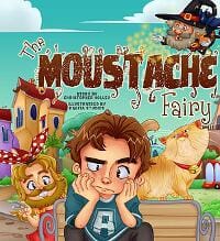
JF: Another winner, full of amusing detail and promise of an equally amusing story within.
Christopher Merlino submitted A Quiver of Cobras: Beginnings designed by Christopher Merlino. “This cover was designed in Abode Illustrator, using Adobe Photoshop for image manipulation. Each piece of art represents a minimum of four layers to achieve the effects you see on the cover.”

JF: The work shows, nicely done.
Connie Cortright submitted Guide Me Home designed by Lisa Hainline. “The story takes place in 1926 in Wisconsin. My heroine travels by train several times in the book, so the cover shows the train tracks in the background. She is carrying an old suitcase and has gloves on which is appropriate for the time period. It pulls the reader into the historical setting.”

JF: Another delicate historical cover, one that uses its soft colors and soft focus to create an appealing atmosphere.
Cynthia D. Witherspoon submitted The Oracle Series: Vols. 1-3 designed by Taylor Freeman

JF: Awkward and not very legible.
Dane Low submitted Angelborn designed by Ebook Launch

JF: Crazy but compelling.
Dane Low submitted Dance With A Dragon designed by Ebook Launch

JF: The delicacy of the flourishes compliments perfectly the classic type, yielding a beautifully textured and memorable cover.
Dane Low submitted My Uncool Love Life designed by Ebook Launch

JF: I like the lighthearted style but it seems to need more contrast.
Dane Low submitted The Booster Club designed by Ebook Launch

JF:Nice details, but overall not very emphatic.
Dane Low submitted The Magical Awakening of Emmy Sukar designed by Ebook Launch

JF: I love the textures and careful lettering on this cover, and how the design perfectly represents the idea behind the title. ★
Dane Low submitted The Night is Filled With Wonder designed by Ebook Launch
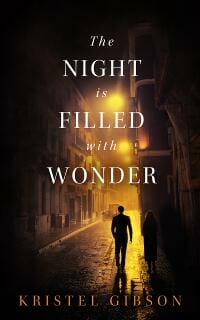
JF: Atmospheric, and the dark border drives us into the central image. Note the careful title type, too.
Diana Stevan submitted The Blue Nightgown designed by Michael Stevantoni. “The Blue Nightgown is a coming of age story set in the 1950s.”

JF: I like the period look of this cover, but I do find the boxes and vertical type distracting.
E.M. MacCallum submitted The Demon’s Grave designed by Amygdala Designs

JF: Both of these series covers are atmospheric and evocative, with subtle scenery at the bottom. This one is beautifully creepy, just right.
E.M. MacCallum submitted The Haunting designed by Amygdala Designs

F.C McLeod submitted CHRISTMAS VALE designed by Dreah Ruark. “Unopened presents return to the Vale at midnight Christmas day. Ariel has just found this present when the clock chimes. She, Ebony and her father, Oliver are linked hand to hand and are being transported to another land.”

JF: The confusing illustration isn’t helped by the weak title.
Geoff Hindmarsh submitted Dragon Dogs designed by Peter O’Connor. “This novel is based on a true story and set in the city of Hong Kong. The Hong Kong skyline towering in the background over a lonely, solitary figure was to give a sense of scale to the problems this character faces, and how, ultimately, the city’s vices overwhelm and consume him.”

JF: It works.
Iain Pattison submitted That’s Why the Lady is a Vamp and Other Quintessentially Quirky Tales designed by Jean Hill. “In this cover to the third volume of the humorous Quintessentially Quirky Tales series, artist Jean Hill promised she’d produce a design that echoed the opening titles to 1960s sitcom Bewitched and wow did she deliver. Whimsical, eye catching and amusing, it’s already attracting praise.”
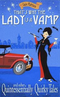
JF: Fun.
James Egan submitted Obsidian Worlds designed by James T. Egan of Bookfly Design. “At full size, the 3-D effect is functional if you’re wearing the red/blue glasses.”

JF: Maybe it would have been a good idea to create a variant for this size that wouldn’t make your eyes hurt to look at it? Because it’s a masterful design.
James Egan submitted Shady Hollow designed by James T. Egan of Bookfly Design
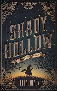
JF: Every part of this cover works together to create an integrated whole. colors and textures are perfectly balanced, and we’re lead right to the fox at the center.
James Egan submitted Whispers of Shadow and Flame designed by James T. Egan of Bookfly Design
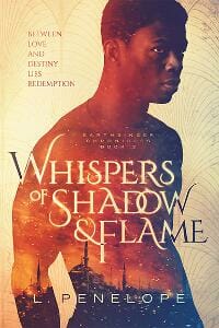
JF: Another cover that seems to effortlessly bring together everything you want in a book cover, from the melding of character and story in the illustration to the careful and unique type treatment of the title, even if it looks optimized for print. Wonderful. ★
Jennifer Park submitted Unwanted designed by Isaac Spoelman.

JF: Oversimplified, murky, lacking in impact.
JJ Mitchell submitted The Kold Kronicles Book 1: Discovery designed by Sarah. “The aim was to create a visual that brought in the various elements described in the book. You can see the katana in the K of Kronicles; the eye has a glittering circle around the pupil – this is the Portal through which Sylvern travel. The pupil also indicates a wing – Sylvern have wings.”

JF: Might be a bit subtle for the average browser, and the title could use more contrast.
Joe Flood submitted Murder on U Street designed by Rachel Torda. “My book is set in Washington, DC, but I didn’t want the stereotypical Washington cover of marbles columns and an American flag. MURDER ON U STREET is set “beyond the monuments” of DC and Rachel’s cover communicates that beautifully.”

JF: Some nice elements, but overall it feels disjointed.
Johan Twiss submitted I AM SLEEPLESS: SIM 299 designed by Sky Young. “Wanted to draw attention to the unique coloration (gray skin and green hair) since colors are important to the storyline. Created our own scifi-ish font to help convey the genre. Went with a white box behind the text to make it pop. The spherical mirror design is applicable to the characters powers.”

JF: It works. The sci-fi elements communicate well and it all ties together nicely.
Josh Tippey submitted The Waking Dream (Or The Tower of the Vessels) designed by Josh Tippey. “The cover is a depiction of the desert of the “the waking dream”, a world beyond the realms of slumber. As Chapter One puts it … “Grey was its sun and sickly green the pall that passed above the expanse, and he knew that it was a globeless world, an eternal world.””

JF: Very flat, attracting little interest, and the type is hard to read.
K. D. Rose submitted I AM (Poetry in Motion) designed by K. D. Rose.

JF: I think I get the idea, which looks like it would be pretty cool but the execution sinks this cover, since in the end it’s full of visual “noise.”
Karri Klawiter submitted For We Are Many designed by Karri Klawiter

JF: The figure walking away from us can be a real magnet to draw us into whatever scene he’s headed for. Here, along with the interesting treatment on the title, it’s done nicely.
Karri Klawiter submitted No Hiding Place designed by Karri Klawiter. “Book Two in the DI Sally Parker Thriller series.”

JF: A powerful composition with adept type handling undone, for me, by the distracting red letters. Why bother? Without them we would be totally focused on the woman and her anguish, and that seems to me a better result.
Karri Klawiter submitted The Terran Gambit designed by Karri Klawiter

JF: Strong sci-fi cover with great spaceship art.
Kate Robinson submitted Heart of Desire: 11.11.11 Redux designed by Clarissa Yeo

JF: Nicely put together cover, but I’m not a fan of the “schizophrenic” font changes in the title.
Kathy Zebert submitted Incredulity designed by Kathy Zebert. “Several people have commented that they love this cover. I designed it in an attempt to catch the reader’s attention.”

JF: I don’t think you succeeded. The artwork is confusing and the typography ineffective. The scale, although clever, will not be of much help in identifying this book as a romantic legal thriller.
Kevin Patel submitted Hide and Go Seek designed by Melissa Coutino. “A dark and gritty thriller with an e-book cover to match. The van shown on the e-book cover is actually a photo of the “Murder Mack”. The van was given that nickname by a couple of serial killers during the 70s in California. Melissa did an amazing job embedding the image into the cover drawing.”

JF: Very scary, and that’s a good thing, although the sans serif type looks pretty out of place.
Kim DDD submitted A Game Of Secrets designed by Kitten from DDD. “Cover design for Historical Romantic Suspense Mystery series, Hearts in Hazard, book 1”

JF: Three terrific series covers that show there are many ways to design series covers. Here, the books all have the same composition but the colors and emblematic objects change.
Kim DDD submitted A Game Of Spies designed by Kitten from DDD. “Cover design for Historical Romantic Suspense Mystery series, Hearts in Hazard, book 2”

Kim DDD submitted A Game Of Hearts designed by Kitten from DDD. “Cover design for Historical Romantic Suspense Mystery series, Hearts in Hazard, book 3”

Kim DDD submitted Chasing Fireflies designed by Milo from DDD. “Cover design for Action, Thriller series A James Beamer Thriller, book 1”

JF: Readers will note that the Deranged Doctor folks (DDD) are real experts at series covers, and here’s more proof. The basic conceit of the cover lets us know we’re in for a gritty thriller, and the invitation to “peek” through the slats to the scene beyond is engaging.
Kim DDD submitted Babylon Girl designed by Milo from DDD. “Cover design for Action, Thriller series A James Beamer Thriller, book 2”

Kim DDD submitted High Card designed by Marushka from DDD. “Cover design for Romance, paranormal series Lions of Las Vegas, book 1”

JF: Yet another series design, this one with elegant type and a good attempt to combine disparate images.
Kim DDD submitted Burn Card designed by Marushka from DDD. “Cover design for Romance, Paranormal series Lions of Las Vegas, book 2”

Kim DDD submitted Summer Sieges designed by Milo from DDD. “Cover design for Epic Fantasy, Sword and Sorcery book”

Kim DDD submitted Sweet Heat Rising designed by Marushka from DDD. “Cover design for Contemporary Romance book”

JF: Cupcakes? That’s a new one for me. Are they bakers?
Kim DDD submitted The Flame Ignites designed by Marushka from DDD. “Cover design for Romance, Mystery Drama book”

JF: A little chaotic, but does communicate its genre.
Kim DDD submitted The Sickness designed by Milo from DDD. “Cover design for horror book”

JF: Nice. I like the eerie tone.
Kim DDD submitted Zola Flash designed by Marushka from DDD. “Cover design for YA Science Fiction Romance Adventure book”

JF: Solid genre cover, not sure I like the very aggressive “Z” cutting through the image, since we end up focused on her shoulder.
LE Wilson submitted T’was a Jackalope designed by L.E. Wilson. “The cover as well as all other illustrations are interactive and include animation as well as music.”

JF: Interesting, haven’t seen an animated cover yet. Here, although the drawings look interesting, this “assemblage” doesn’t really add up to an effective book cover for marketing purposes.
Lily Erlic submitted The Golden Sphere designed by Martin Erlic. “The cover design was produced from an out of copyright painting. The designer added the light from the cave to represent the golden sphere.”

JF: Keeping it simple paid off.
Linda Govik submitted Legacy designed by vkncharlie (Fiverr). “I asked the designer to make the design very simple, because I don’t want to draw attention from the image, and I also wanted it classy and elegant, as it’s historical fiction. In my mind, it came out exactly how I wanted it.”

JF: I like the simplicity and elegance of this cover, but since a lot of its effect depends on the title treatment, I think the “LE” should have been more legible and not just left to disappear against the white part of the background.
LJ Anderson submitted Forget Tomorrow designed by LJ Anderson, Mayhem Cover Creations

JF: Lovely art, but it seems to have pushed everything else aside.
LJ Anderson submitted The Foxglove Killings designed by Mayhem Cover Creations

JF: Despite everything, it’s hypnotic. Incarcerated by typography!
Maggie Larche submitted The Mardi Gras Chase designed by Maha Khatib. “This is a middle grade mystery for girls, ages 8-12. Thanks!”

JF: Totally delightful, the shadow and action complement your heroine perfectly. ★
Mallory Rock submitted The Demon Stone designed by Mallory Rock
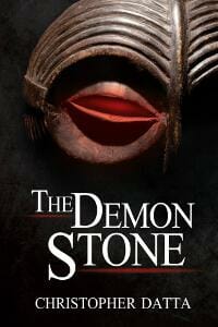
JF: What makes it stand out is its nod to surrealism.
Marta D’Asaro submitted Il Festival Dei Cerotti designed by Marta D’Asaro

JF: All four of these covers use graphic design elements quite well, but would be much more effective as print book covers. In the ebook universe, covers this quiet are apt to get overlooked, and they don’t translate well to screen. This is the best as this translation, since it relies on very simple shapes.
Marta D’Asaro submitted Il Tempo Dei Fantasmi designed by Marta D’Asaro

Marta D’Asaro submitted Topeca designed by Marta D’Asaro

Marta D’Asaro submitted TRA ROTHKO E TRE FINESTRE designed by Marta D’Asaro

Matt Sinclair submitted Horrors: Real, Imagined, and Deadly designed by Charlee Hoffman. “The designer and I wanted something unique but with a creepiness factor that caught readers’ attention. We also didn’t want a stereotypical horror font, but one that didn’t make readers say, “What the heck were they thinking?” Initial response has been very positive, but I know it’s a risk.”

JF: Great ideas, but somehow you ended up with a cover that looks as if it was intentionally made to be difficult to read.
Micah Hansen submitted Doppelganger Smile designed by Micah Hansen. “My first entry. Hope you like it.”

JF: Beautiful and well focused on the central figure.
Michael Miller submitted The Dragon’s Blade: The Reborn King designed by Rachel Lawston. “We sought a modern fantasy design for this cover – one that would covey the sense of the genre immediately whilst not being a dated looking illustration or include a character. The Dragon’s Blade, on the cover, can summon forth fire and this element is included in the design to enhance it’s impact.”
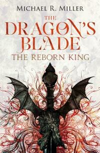
JF: It’s a gorgeous design with great typography but it does look like it was repurposed from the print original. A little tweaking would make this an even better ebook cover. ★
Michelle Schlicher submitted The Blue Jay designed by Hanna Piepel. “The use of the color blue not only complements the title well, it also stands out against the black and white of the feathers. While simple, the image pops and ultimately intrigues potential readers to find out why a story about mentoring has a cover like this one.”

JF: The strong art and simplified type are perfect components of an ebook cover. ★
Peggy Lampman submitted Simmer and Smoke: A Southern Tale of Grit and Spice designed by Derek Murphy. “I found cover artist Derek Murphy’s name on your site and am quite pleased with the cover he created. I believe it appeals to folks that enjoy reading novels about mother-daughter relationships, food and the American South.”

JF: I think you’re right!
Pippa DaCosta submitted Girl From Above designed by Pippa DaCosta. “As an author known for gritty, fast-paced urban fantasy books, I wanted to convey a smilier feel, while communicating sci-fi, as a genre. This clean, but striking design continues throughout the series.”

JF: Nice job and very clean. I would avoid creating two competing focal points, and watch out for “fitting” type into spaces the way you have: either pull back or overlap, the shapes rubbing up against each other is distracting.
Rain Arlender submitted Y designed by Dóra Várkonyi. “Our whole life is an endless Y. As you head up its stalk you always have two options – but the possibilities live inside of you, not in the circumstances – whether you choose right or left, once you have chosen, the road splits into another Y – and you can once again ponder on what to pick next.”

JF: (Shares title of the month awards with its twin, below.) A Fanciful, if binary, view of the world accompanied by an equally fanciful cover.
Raman Bhardwaj submitted Wizzie the Wonder Dog Saves The Day designed by Raman Bhardwaj. “This book is about the heroics of a Yorkshire Terrier dog who saves a drowning kitten from the family backyard pool. The cover shows the proud Yorkie dressed in a superhero cape and crown which the proud owners gave him after his brave act. The kitten drenched in water is also standing behind him.”

Richard Sullivan submitted The First Ward III: Murderers Scoundrels and Ragamuffins designed by Richard Sullivan. “This design came together in just a few minutes once I found the image of ragamuffins in costume. I did not bother with alternates as this immediately felt right. 100 years ago trick or treating was done on Thanksgiving Day morning. Only later in the century did Halloween co-opt this custom.”

JF: But it’s the designer’s eye that sees and seizes on this particular image, this particular detail, and combines it with a deft hand at typography.
Robert Colton submitted Murder Most Haunting designed by Robert Colton & DNZSEA. “The book cover quickly tells the reader that this story has a mysterious death taking place in an eerie setting.”

JF: Yes, it’s perfect, but I’d love to see the title moved down a smidge, away from the edge.
Roseanna White submitted Thank You for the Shoes designed by Roseanna White Designs. “The author wanted the title to be the most prominent feature, but for the cover to also convey the Old World (of Italy, the character’s homeland) with the new life he finds in America.”

JF: Lovely. A contemporary cover with classical elements.
S Marie Carlson submitted Armistice designed by S. Marie Carlson. “Armistice has had many comments on the cover ranging from gorgeous to eye catching, which is exactly what I was going for while designing it. I wanted it to draw people in and make them want to know what was in the pages beneath the cover.”

JF: Attractive.
Scott Johnson submitted The Wolf Hound and the Raven designed by Scott Johnson. “As a designer I designed the cover as well as writing the novel. I wanted to create something that was unique and really stood out. I created a minimalist design using illustrations rather than a photographic route. The meaning of the twelve icons becomes clear as you progress through the story.”

JF: Skillful, but it looks corporate to me, not so much like an exciting tale.
Shane Jason Taylor submitted Y designed by Scarlett Rugers

JF: Much more sophisticated and dynamic than the earlier book with the same title above. This one is imposing, totally in control, with no confusion about who it’s appealing to, and one of the strongest hooks into the story I’ve seen in some time. Excellent. ★
sharon bloch submitted REXY AND THE HOUSE OF MIRRORS designed by MURRIAM SAEED (illustrator). “Hi, I just wanted to give you the extra value of the join work between an Israeli writer to an Afghani illustrator. I am so proud that art and creation can over come religious and prejudices .I believe this way we make the world a better place. :)”
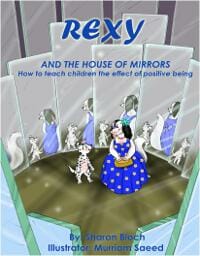
JF: Thank you.
sharon bloch submitted REXY THE GARDEN OF THOUGHTS designed by MURRIAM SAEED (illustrator).

JF: This is the strongest of the Rexy covers, because it makes a clear statement with its bold title and close-up view of the main character.
sharon bloch submitted REXY THE TRIP designed by MURRIAM SAEED (illustrator).

Simon James submitted Ghost Note designed by Simon James

JF: The type-on-photo version only works when you’ve got a much stronger image than what we see here.
Stephanie (Leigh) Loggins submitted As It Rains designed by Stephanie (Leigh) Loggins. “A large portion of this story takes place in a North Eastern forest. The oval design and silver/black color scheme represent future technology in the novel. The font style is used because the over-arcing story is a romance with our two main characters on the front.”

JF: A good effort, but it’s difficult to combine black and white images with color ones gracefully, and the large expanse of dray background robs some of the drama.
Stephanie Johnson submitted Airships & Alchemy designed by S.L. Johnson. “Cover elements based on author’s suggestions and utilizes vector images instead of hand-drawn elements, which is a departure for the designer from her usual method of creating book covers.”

JF: A little over busy with no clear focus.
Stephanie Johnson submitted Chastity Flame designed by S.L. Johnson. “Cover design for one of three separate covers created for Laity’s sexy snd thrilling 3-vol Chastity Flame series.”

JF: Interesting idea, needs stronger type.
Stephanie Johnson submitted Heart of Fire designed by S.L. Johnson. “Cover design for one of three separate covers created for J. Damask’s Jan Xu 3-vol series.”

JF: I like the psychedelic look, but the title is very weak.
Stephanie Johnson submitted Noir Carnival designed by S.L. Johnson. “Cover design inspired by the contents and retro book covers.”

Stephanie Johnson submitted Pseudopod Tapes, Vol. 1 designed by S.L. Johnson. “First cover designed for Fox Spirit Books – designer used the idea of horror/radio broadcasts as inspiration.”

JF: Elements without a focus, fighting for attention and I include the title in that.
Stephanie Johnson submitted Weird Noir designed by S.L. Johnson. “Cover design inspired by the contents and retro book covers. Designer desired to create something fresh & different instead of the usual ‘stock photos with unattractive font’ that seems to be ubiquitous in the publishing world.”
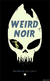
JF: Clever and effective, it stands out.
Stephanie Johnson submitted White Rabbit designed by S.L. Johnson. “The cover design elements are directly inspired from key plot elements in the story: white rabbit and spirit kettle.”

JF: There’s something very 1930-ish about this design.
Steve Doherty submitted CALL FOR BLOOD designed by Evan Sommer.

JF: Gets the job done.
Steven Lloyd submitted Strange Roads designed by Zach McCain.

JF: The atmospheric image makes it work.
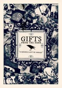
Tabatha Stirling submitted Gifts From The Dark designed by Tabatha Stirling. “Thank you.”
JF: A charming design that’s better suited to the paperback version. Again, it could easily be tweaked to make a wonderful ebook cover.
Tamara Lush submitted Hot Shade designed by Christopher Keeslar. “Hello! The cover designer and I worked to create a Florida noir feel for my romantic suspense novel: sun-soaked, sexy and slightly mysterious. Thanks! Tamara”

JF: I like it but not the overworked effects on the title.
Tammy Seidick submitted Indiscreet designed by Tammy Seidick. “Thanks for your review!”

JF: The genre appeal is direct and workable, but I wonder about that cool blue in the background.
Timothy Imhoff submitted Painted Wings designed by Peggy Nehmen. “The image of colorful wings is both an important part of the story and a recurring metaphor in this sensual, women’s fiction novel.”

JF: A beautiful cover that breaks out of the mold with a graphic interpretation.
Todd Ohl submitted Hands of Other Men designed by Todd Ohl. “This was a genre change from my first book, so I needed something different in look and feel. Also, the Western genre tends to have a lot of sepia-toned covers, so I wanted something that would stand out against them.”

JF: The idea is good and that’s an amazing sky, but the title type has some serious spacing issues.
Tony Mayo submitted Crimes of Cunning designed by Miroslav Jolic.

JF: Graphically clever and amusingly attractive, the businessman on the high wire is enough to grab our attention. Needs a border around it.
Tootie-Do Press submitted Cryonic Man: A Paranormal Affair designed by Clarissa Yeo

Victoria Pann submitted Only the Mountains designed by James T. Egan. “Native Americans in a post-Apocalyptic world, a visionary red horse, and eternal mountains all figure into this romance with plenty of action, adventure, and survival. Curly letters speak of romance, the smudged edges suggest the book itself went through the adventures.”

JF: A beautiful cover with great texture, but I don’t see as much of the story in it as you do.
Vivian De Winter submitted Augusta Louise designed by Vivian De Winter. “For my first published novel, I must have gone through over twenty variations, until I designed this version. The bit of “grunge” stands for the mystery aspect, the rooster represents the rural setting and comedy aspects, the colourful flames symbolize fire (an ongoing theme).”
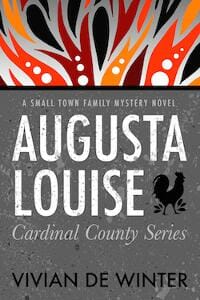
JF: Well done, very neat and tidy.
Yvonne Less submitted Socrates and the Sentinel – A John Tesh Novel designed by Art 4 Artists. “I created this science fiction book cover for the Australian author Thomas Fay and it is, in his own words, exactly what he had in mind.”

JF: Everything you want in an exciting sci-fi cover, with great font choices and relevant image compositing.
Nonfiction Covers
April Bryant submitted The Simple Guide to Great Photography designed by April Bryant.

JF: A lovely photo, but the type doesn’t seem to have made up its mind what kind of book this is.
Carrie Pennington submitted Phoenix from the Ashes: Poetry from Personal Struggle, Rebirth, and Triumph designed by Le Fey Designs. “This collection of poetry is about a personal journey from the darkness of depression to seeing a light at the end of the tunnel. The cover of this represents that process by showing a girl surrounded by dark ruins yet covered in flames. She is symbolically a phoenix on her burning day.”

JF: I don’t think the artwork shows her very well, and the type needs to be readable and have more of a role in the overall design.
Chelsea Flagg submitted I’d Rather Wear Pajamas designed by Kelly Angelovic. “While finishing up my funny memoir, I kept looking at professional cover designers for my artwork, but was less than inspired by the stock photo approach, so found Kelly to illustrate my cover for me. It’s perfection!”

JF: I couldn’t agree more, you made a great choice and ended up with a delightful, emblematic cover for your book. ★
Dan Van Oss submitted Shopping Survival Guide for Men designed by Dan Van Oss.

JF: Clever and punchy design looks just right on this book, along with the camo background, man with a pipe and other design details that add to the masculine look.
Dane Low submitted Five Years In Employment Hell designed by Dane at CreativIndie Covers.

JF: I like the way the title has been amusingly integrated into the artwork, making the subtle point of just how our jobs contain and define us. ★
Dane Low submitted Never Binge Again designed by Ebook Launch

JF: A strong ebook cover that makes its point in an amusing and very direct fashion, a winner.
Dane Low submitted Unapologetic designed by Dane at CreativIndie Covers.

JF: Bound to appeal, the graphics of the cross/treee will be a strong draw for this book’s potential readers. ★
Ethan Gregory submitted I’m Sorry, You Are Not a Pick-Up Artist designed by OJ. “After seeing the movie poster for James Bond film, You Only Live Twice, I thought it was a perfect image to use for inspiration.”

JF: Not sure the cartoon is helping you here, and the type is a bit brutal.
Hemalatha Gnanasekar submitted THE GUILT IS ALIVE designed by M/s.Gyan Publishers. “The E-Book titled “The Guilt Is Alive” is a Memoir first published by a traditional publisher in India. Using the same book cover, I had self published it through Amazon Kindle.”

Jon Rouco submitted La Ley designed by Jon Rouco.

JF: I find the boxes awkward and claustrophobic, and that tiny line of type is unreadable even when it’s enlarged.
Lesley Moss submitted The Busy Mums Guide to Small Business Financial Records designed by Lesley Moss. “The book cover is based on the branding I developed for the author’s business that this book was published under. (Mums Tax Support) It is bright and colourful and not your ‘typical’ tax guide cover. It stands out and it ties in with the strong colours that have become familiar with this company.”

JF: I love the lighthearted tone and art of this book on what could be a deadly dull subject. Combined with lovely colors it really works, although I worry that the large words in the background are competing with the title. ★
Mallory Rock submitted Who Do I Call My Countryman? designed by Mallory Rock

JF: This one doesn’t come together for me, and the title treatment, compressed type jammed together all in black, is particularly unattractive.
N. J. Lindquist submitted Hot Apple Cider with Cinnamon: Stories of Finding Love in Unexpected Places designed by N. J. Lindquist.

JF: The latest in a series, I love the happy yellow color and the warmth and approachability of the typography.
Richard Lowe submitted Safe Computing is Like Safe Sex: You have to practice it to avoid infection designed by theamateurzone.

JF: Looks very corporate, which is probably fine for a textbook, but with a title like that, you would think the cover would have a bit more sizzle.
Stephanie Johnson submitted Rook Chant designed by S.L. Johnson. “Design based on rook photo taken by book’s author.”

Steve Petrou submitted All I Ever Wanted was to be Called Mom designed by Rachel Lopez. “It is a true life story about dealing with trying to get pregnant, infertility, IVF, nightmare pregnancy and nightmare birth.”

JF: Well put together cover that succeeds because of the careful typography that complements and amplifies the message of the photo.
Sylvia M Dallas submitted The Right Kind of Intimacy designed by Alex Lewis. “The cover depicts a woman who has found a new level of intimacy with God. She is so in love with the lover of her soul that the love she is experiencing causes her to expose her heart. The stars and light around her shows that even here on earth she is caught up in the heavens with God.”

JF: I’m happy for her, but the cover is pretty unattractive. The drawing of the woman makes her look like a poorly-made doll, I have no idea what those shapes are protruding behind her, and the type has nothing to add.
Well, that’s it for this month. I hope you found it interesting, and that you’ll share with other people interested in self-publishing.
Use the share buttons below to Tweet it, Share it on Facebook, Plus-1 it on Google+, Link to it!
Our next awards post will be on January 25, 2016. Deadline for submissions will be December 31, 2015. Don’t miss it! Here are all the links you’ll need:
The original announcement post
E-book Cover Design Awards web page
Click here to submit your e-book cover
Follow @JFBookman on Twitter for news about the E-book Cover Design Awards
Check out past e-Book Cover Design award winners on Pinterest
Subscribe to The Book Designer Blog
Badge design by Derek Murphy


