

Welcome to the e-Book Cover Design Awards. This edition is for submissions during October, 2013.
This month we received:
99 covers in the Fiction category
17 covers in the Nonfiction category
Comments, Award Winners, and Gold Stars
I’ve added comments (JF: ) to many of the entries, but not all. Remember that the aim of these posts is educational, and by submitting you are inviting comments, commendations, and constructive criticism.
Thanks to everyone who participated. I hope you enjoy these as much as I did. Please leave a comment to let me know which are your favorites or, if you disagree, let me know why.
Although there is only winner in each category, other covers that were considered for the award or which stood out in some exemplary way, are indicated with a gold star: ★
Award winners and Gold-Starred covers also win the right to display our badges on their websites, so don’t forget to get your badge to get a little more attention for the work you’ve put into your book.
Also please note that we are now linking winning covers to their sales page on Amazon or Smashwords.
Now, without any further ado, here are the winners of this month’s e-Book Cover Design Awards.
e-Book Cover Design Award Winner for October 2013 in Fiction
Paul Allen submitted Apeland designed by Jeroen ten Berge.
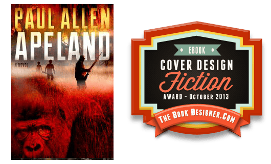
JF: Another demonstration from previous winner Jeroen ten Berge of how a great designer can effortlessly draw us into the story, give a hint of the tone of the book, while keeping the elements and typestyles to a minimum. The air of menace is visceral, a real winner.
e-Book Cover Design Award Winner for October 2013 in Nonfiction
Damon Za submitted Skirts At War designed by Damonza.
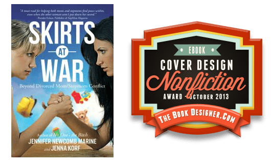
JF: My favorite title of the month, and a designer who knows how to create tension while still keeping it light. The graphic elements of this cover are strong enough to withstand the reduction from a paperback original, even though some of the type is too small to read at this size.
Fiction Covers
A. Wrighton submitted Allegiance: Dragonics & Runics Part II designed by A. Wrighton. “Enjoyed working on the cover for my genre-bending fantasy/steampunk/new adult book. Hope you enjoy! I’d love to hear your thoughts!”

JF: Nicely atmospheric, but so much of this cover is “void” that it doesn’t communicate as well as it might.
Alex Rosaria submitted At Arms designed by A.Rosaria. “The Medieval Vector I used in the design is made by Eric Fritz.”

JF: Images that don’t combine well at all, and type that’s difficult to read.
Alison Morton submitted INCEPTIO designed by Alena Brozova. “INCEPTIO is an alternate history thriller, the first of the Roma Nova series. I asked the designer to use imperial purple and gold colours, Roman iconography with a contemporary graphic style to meld together the ‘Romanitas’ of the world within the book and the modern setting in the 21st century.”

JF: The artwork is accomplished, but some of the details are cryptic, like what’s that “I” doing up top, and is that a flying saucer?
Andrea Worthington submitted The Salinger Contract designed by Mauricio Díaz. “A very elegant way to reference the author and the genre.”

JF: An interesting concept held back by a weak font choice and an overall murkiness.
Andy Fielding submitted Helter Skelter: Part 2 of the Triskell Story designed by Andy Fielding.

JF: Another winner from Andy Fielding who is a previous winner here, and a good example of how to create a cover that’s fun, interesting, and that draws us into the story. ★
Austin Briggs submitted Five Dances with Death designed by Damonza.com. “This is the third attempt at a great cover for this book. Damon and I wanted to create a beautiful cover that clearly shows that the book is set in the Aztec history, without going over the top with the recognisable symbols such as pyramids and skulls. We also wanted to create a cover that’s easy to brand across the entire series. I love the typography, the use of empty space, and the conflicted mood–although I’m still unsure about the calendar that we used to ground the cover in the historical period. Austin.”

JF: The calendar supplies some welcome texture to the background of this interesting and attractive cover.
Bonnie Koenig submitted Taken by the Sound designed by Bonnie Koenig. “Taken by the Sound is the second in a series of urban fantasy novels set outside of Seattle.”

Bridget McKenna submitted Hit designed by Bridget McKenna for Zone 1 Design.

JF: An interesting image that would have benefitted from a more nuanced approach to the typography. And it would highlight the bird much more if the type was in a different color. Here, the thick white letters and the white of the clouds compete for attention.
Bridget McKenna submitted The Bard Effect designed by Bridget McKenna for Zone 1 Design.

JF: Amusing and clever, it made me want to read the story.
Bridget McKenna submitted The Brotherhood of Trees designed by Bridget McKenna for Zone 1 Design.

JF: A lot to like here, especially the combined images, but the dark green type is fading a bit too much into the background for my taste.
Bridget McKenna submitted The Good Pup designed by Bridget McKenna for Zone 1 Design.

JF: Can’t go wrong with a dog on your cover, eh? Would have liked the title to be much more visible instead of fighting with the background.
Candace Carrabus submitted Raver, The Horsecaller: Book One designed by Faye Rice. “We wanted a cover that would convey this is a fantasy and a story where the horses are center stage. But finding the right horse was difficult! Once we did, the rest fell into place.”

Carly Drake submitted Words Once Spoken designed by Danielle Maait.

JF: Notice how the designer creates a background for her type to make sure it’s visible. Color adds a lot to the influence of this interesting cover, as does the custom treatment of the title type.
Carol Mizrahi submitted Coming of Age . . . AGAIN designed by Carol Somberg.

JF: Looks a lot more like nonfiction than fiction.
Charlene A. Wilson submitted The Transformation of Anna designed by Charlene A. Wilson. “Thank you for this opportunity!”

JF: Nice job, Charlene, but I encourage submitters once again to please submit covers without award badges, they just obscure what we’re trying to see.
Charles Templin submitted Pawnworld designed by Charles Templin. “Hello! I had at first imagined my cover to be sophisticated and classy, but then I thought nahhh. I went for a genre shout-out, and hopefully a good hook. I did my own cover, so I can’t complain if I didn’t get what I wanted. Whata ya think? Did I help or hurt my book?”

JF: If I could figure out what the heck is going on, or even exactly what I’m looking at, I might be able to answer that question. Hire a pro.
Chris Kennedy submitted Occupied Seattle designed by Giorgio Valentini at Genesis Graphic Design. “This is the second book in the Occupied Seattle series. With its cover, Giorgio and I chose to stay with the city skyline theme of the first book (Red Tide), taking into account the advice that you gave when it was submitted (July, 2013). We tried to go with a strong graphic and a clear message: China now owns Seattle!”

JF: Well done, it’s emphatic, with a great hook into the story.
D. Marcus Webb, Sr submitted Rebound: It’s Just Not For Basketball designed by Vivanka @ www.fiverr.com.

JF: So, did it cost $5? Kind of looks like it. And thanks for introducing us to this new genre, “post divorce dating erotica,” that’s a new one for me.
D.E. Morris submitted Aliens in the Gift Shop designed by D.E. Morris. “Self-designed in Photoshop using custom made graphics or royalty free images.”

JF: An interesting concept that would require quite a bit of skill—in addition to the right tools—to carry off, which isn’t the case here.
Damon Za submitted Balancer designed by Damonza.

JF: Interesting “Carrie”-esque cover in which the designer demonstrates you don’t necessarily need fat, distressed, compressed type to make an impact. Design itself is much more important.
Damon Za submitted Do I Bother You At Night designed by Damonza.

JF: Beautifully creepy and very self-assured.
Damon Za submitted Dolfin Tayle designed by Damonza.

JF: A beautiful and multi-layered design that delights and intrigues, dazzling. ★
Damon Za submitted Fearsome designed by Damonza.

Damon Za submitted Ninety Eight designed by Damonza.

JF: Notice how the designer controls our eyepath, inexorably drawing us down to the woman on the couch.
Damon Za submitted Plus None designed by Damonza.

Damon Za submitted Scars of Ambition designed by Damonza.

JF: Shows how very heavy type effects rarely add to a cover more than they distract, and that holds true here where there’s plenty going on without all that chiseling.
David Bone submitted Styrofoam Throne designed by Nick Lakiotes. “Artist Nick Lakiotes is a swiss army knife of style. He was able to perfectly balance “Styrofoam Throne” as a dramedy that took place in a horror themed world. This could have easily turned out too soft or too hard on the horror. Nick’s vintage black light poster aesthetic brought the book’s vibrant heart to life under any light.”

JF: An interesting image just crying out for stronger typography and better overall composition.
Dick Waters submitted Scent of Gardenia designed by Dick Waters/Kurt Bredt. “Joel, This is the first novel in the Scott Tucker series where I took a more direct role in the design. The artwork of the Scent of Gardenia’s cover was by Kurt Bredt from input from Dick Waters, who is the author. The cover needed to depict the essence of the novel. A beautiful redhead who had a scent of Gardenia. A sweet scent that masked the hidden dangers of her beauty. If you look closer you will see men’s heads and hands in the petals of the flower. That is to symbolize that she keeps men for her own consumption. Thanks again for the opportunity to display Kurt’s talent.”

JF: An alluring cover, although some of your effects may be too subtle to be seen at this size, and the title could integrate better with the whole.
Dixiane Hallaj submitted Aunt Nellie B designed by Centrepiece Productions/ Velvet Wings Design. “I loved working with Kimberley Rose of Velvet Wings Designs (of Centrepiece Productions). We were trying for a simple design that looks good as a thumbnail as well as scaled up for the POD option.”

JF: I love the image but overall the cover feels a bit too oversimplified.
DJ Edwardson submitted The Jammer and the Blade designed by DJ Edwardson. “Cover for dystopian science fiction novella.”

JF: I find it hard to get a coherent message from this image.
Donna Collier submitted The Guide designed by Donna Collier.

JF: Although many elements on this cover are polished, the effect is way too busy, with too many things going on to give one, strong, unified message.
Donna Kaulkin submitted Brenda Corrigan Went Downtown designed by Ana Eastep. “Thank you for considering this cover design.”

JF: Shows that a competent print book cover doesn’t necessarily work for ebooks.
Dylan Jones submitted Black Book designed by Dylan Jones. “I hope you like the cover?”

JF: Love it! Beautiful atmosphere, great use of fonts, a controlled palette that helps focus us on the composition. ★
Elizabeth Bruner submitted The Out of Order Detective designed by Neil Wells. “The cover is for a collection of super short stories about a time travelling detective who specializes in supernatural clients.”

JF: The image seems unnaturally dull, and the type has not been handled very well.
Ella Medler submitted Blood is Heavier designed by Patti Roberts. “Patti Roberts, of Paradox Book Cover Designs & Formatting has designed both covers in this action thriller trilogy, but this one is my favorite.”

Emily Otto submitted Caught on Film: An American Nightmare designed by Emily Otto. “I designed this for my husband, Andy Otto’s debut novel, “Caught on Film: An American Nightmare.””

JF: Despite a good deal of incoherence, I like this ebook cover exactly because it doesn’t look like every other ebook cover, and it’s got a sense of humor, too.
Falafel Jones submitted Life’s a Beach Then You Die designed by Falafel Jones.

Gregory Delaurentis submitted Cover of Darkness designed by Damonza.com. “A simple book over that conveys a lot of information about the book in a single image.”

JF: It’s anything but simple to cram this much story onto a cover without it collapsing under the weight, but the designer carries it off nicely. Reminiscent of movie poster art.
Haim kadman submitted The death sciences designed by Boaz Kadman.

Ivy Schexnayder submitted Icarus Incident designed by Ivy Schexnayder. “This is the first book cover I have ever designed. I designed it for my brother who is just starting out as an author. I wish I had seen your website first as I found a few things I would do-over now. I used some stock artwork that I touched up and made to fit what we were looking for.”

JF: Ivy, you’ve made a great start. You might try getting rid of the stripe or dropping it to the very bottom of the cover and emphasizing the title a whole lot more.
J Thomas Beaton submitted Duality Inc designed by J Thomas Beaton. “I designed this cover for my ebook, Duality Inc.”

JF: Definitely gets your attention, and that’s half the battle.
J.A. Blackburn submitted Dragon Defender designed by Jason Blackburn. “The designer is my husband, Jason Blackburn. Jason graduated from the Art Institute of Seattle – while there he was a finalist in the Society of Illustrators contest. But he set aside his dreams of book cover illustration and took on user interface design. With this book I was able to get him back to the (virtual) drawing board with fantastic results.”

JF: Well suited to its genre.
J.A. Howell submitted Possess My Heart designed by J.A. Howell. “This is book 3 in my Paranormal/Urban Fantasy series, The Possess Saga.”

JF: Simple and effective.
J.A. Howell submitted To Have & To Haunt designed by J.A. Howell. “This is book 4 of my Paranormal/Urban Fantasy series, The Possess Saga.”

JF: The image lacks the clear simplicity of the earlier cover, just above.
Jack Waddell submitted Tuesday’s Caddie designed by Jack Waddell. “Used a vintage photograph copyright free from the Library of Congress and PhotoShop to compress and age it slightly. I tried for simplicity in the type style with a subtle contrast between the title/author and the subtitle line.”

JF: A tasteful way for an author to create a perfectly usable ebook cover with very simple elements.
JACQUIE UNDERDOWN submitted Beautiful Illusion designed by Danielle Maait.

Jake Taylor submitted Silence In Numbers: File One designed by Christa Holland, Paper and Sage Design. “Silence In Numbers: File One is a military science fiction novel that includes a cyberpunk military ops team as well as paranormal and supernatural phenomenon. Christa captured that feel perfectly.”

JF: A skillful design that may be a bit too detailed for this format.
James Egan submitted Pivot designed by James T. Egan, Bookfly Design. “The author commissioned Bookfly to design a new cover for Pivot, a psychological horror novel that’s drawing rave reviews.”

JF: Strong graphics and a sure sense of composition make this cover leap off the screen, almost demanding a click through. Outstanding. ★
James l submitted Nine Inch Bride: A Stone of Conscience designed by anonym.

JF: The triumph of incoherence.
Jamie Thornton submitted Rhinoceros Summer designed by Jamie Thornton. “Young Adult / New Adult crossover adventure. Thanks for taking a look!”

JF: It amazes me when authors are able to produce covers that are as delightful as this one. Nice job.
Jason Strange submitted The Tree and the Light designed by Massivebrain.com Illustrator. “Book was just released 26 September on Amazon.”

JF: Uh, half the title seems to be falling off the bottom?
Jeffery Rogers submitted Told You So designed by Jeffery Rogers.

JF: Cool and spooky at the same time.
Jennifer McMurrain submitted Winter Song designed by Brandy Walker of Sister Sparrow Graphic Designs. “Brandy Walker from Sister Sparrow Graphic Design put this cover together for me. I think that it is stunning. It grabs people’s attention and pops off the shelves. I love that she “got” the dreamy feel that I was looking for.”

JF: A beautiful piece of artwork for an engaging cover.
JENNY BRIGALOW submitted THE CHILDREN OF THE MIST designed by Danielle Maait.

JF: In this and some of her other covers here, you can see that designer Danielle Maait understands exactly what genre readers are looking for, and delivers it.
Jenny Schwartz submitted It’s Love, Dude designed by Danielle Maait.

JF: In this one, the colors present some legibility problems but the “hook” is unmistakable.
Jill Engledow submitted The Island Decides designed by Cynthia Conrad Design. “The Island Decides is a novel in the “women’s fiction” genre that begins when a lost child turns up in a hippie commune on Maui in 1971, and her mother goes to Maui to reclaim her. Designer Cynthia Conrad and I put this cover together using a stock photo from 123RF.com. Cynthia removed another child”

JF: A cover with some good elements but absolutely no dramatic tension.
John E Kelley Jr submitted Hat Madness designed by John E Kelley Jr.

Jonathan Bastable submitted Devil’s Acre designed by Ian Denning. “This is a novel about love, Russia and forbidden architecture, set in Moscow and Leningrad (St Petersburg). The cover designer, Ian Denning, used a 1930s map of the new Soviet Moscow as the background. On top of this sits an outline of the Stalinist skyscraper – the Palace of Soviets – that was intended to replace the Cathedral of Christ the Saviour (shown at roughly the same scale). The jagged outline in red suggests some kind of inferno, like the flames of hell, as well as describing the outline of the failed communist project.”

JF: A beautiful and well-designed cover, and I really like the texture the map adds to the background without interfering with the rest of the illustration.
Jude Ouvrard submitted Wonderland designed by Steven Novak. “Hi, This is my second novella! Hope you like it. Jude”

JF: I really like it, except every time I look at it it says “Onderland” to me.
Juliet Madison submitted Starstruck in Seattle designed by Danielle Maait.

JF: Danielle Maait is so accomplished at putting together these genre covers she makes it look easy. Which it’s not. I really like the energy in the image at the top, the fun and playfulness comes across despite the way the designer has obscured the figures’ identity. ★
Karen Fredericks submitted Butterfly Comes To Town designed by Karen Fredericks. “This is the first book in the Ant And Butterfly series for children. I wanted to set a simple style that would work for each of the stories that follow, showing the characters and a few details that give a hint of what the story is about.”

JF: Charming art, might need a more fitting typeface for the title.
Kate Curran submitted Only for you designed by Fantasia frog designs.

KATHERINE GIVENS submitted IN HER DREAMS designed by Danielle Maait.

JF: Despite the artistry the designers has brought to this cover, it does present the question, “Why an empty couch?”
Kay Leitch submitted Treasure This designed by John Dinsdale. “Treasure This is a children’s book – a whodunit for ages 10+. As I was on a tight budget, the Designer, John Dinsdale, used Shutterstock for the images. I love what he’s done, especially considering my financial constraints. Thanks, Kay Leitch”

Kenechi Udogu submitted Aversion designed by Abona Frost. “This is the cover for the first in The Mentalist Series, a YA paranormal romance novella series. Published in Dec 2012.”

JF: I would have said sci-fi at first glance. The series line above the title looks like it’s running into the large “A”, and the author’s name is desperately in need of kerning to even out the inter-letter spacing.
Kim Cresswell submitted REFLECTION designed by Marion Sipe. “A nice mix of romance and suspense.”

Lance Charnes submitted South designed by Damonza. “I wanted something that would speak to the book’s setting, the U.S./Mexican borderlands. Damon once again was able to wade through all the material I dumped on him to come up with a cover that has already drawn praise from a number of people (including people who aren’t related to me).”

JF: Damon once again shows how to pick just the right details, and present them in just the right way, to get the maximum impact. I think a cover like this one can really help your sales.
Laura Burroughs submitted The Foxes of Caminus designed by Cindy Burnes. “The challenge was to come up with a look that conveyed being in the woods at night without actually showing a lot of trees. The branches hanging down against the over-sized moon really set out the focus for the rest of the cover. The gate was to be imposing, yet the other side was to be alluring.”

LAUREN K. McKELLAR submitted Finding Home designed by Danielle Maait.

JF: Perfectly positioned for its audience. Moody, a little edgy, and firmly hooked into the coming of age journey.
Leonard Kinsey submitted Hollow World designed by Pentakis Dodecahedron. “Art by Payton Craft, Design by Pentakis Dodecahedron. We’re billing “Hollow World” as “‘Die Hard’ in Disney World”, so we decided to go for a very cinematic/movie-poster type of cover.”

JF: I really like the idea, but the illustration seems to have intimidated the type, forcing your title up into a corner. Would love to see this with the title 40% larger and allowed to overlay the illustration a bit.
Liza Perrat submitted Wolfsangel designed by JD Smith. “Thanks, Joel, for this opportunity for publicity and for accepting my entry. Best, Liza Perrat”

JF: I can see the story elements you’ve brought into this cover, but the vast space at the center makes me uncomfortable about how much of the woman’s figure has been pushed off the edge.
Mallory Rock submitted A Convocation of Kings designed by Mallory Rock.

JF: Nicely done cover that will appeal to this genre’s readers. ★
Matthew Dean submitted A New Home (The Adventures of Cara & Charlie #1) designed by Matt Kump. “This cover was a collaboration with the brilliant designer, Matt Kump. I wanted a cover that had the feel of an old, “discovered” book, like something you might find in your grandmother’s attic. Matt pulled that off with simplicity, texture, and gorgeous typography, with the added touch of making the embossed ink “worn” after years of passing through various hands. With this design, the books, to me, feel like a character in this series, and I love the covers he’s done for all of these.”
")
JF: Well, it would be great for a paperback, but look at the other covers in this post—this one really recedes, and that’s not a good thing. A lack of contrast and drama is making it “disappear” a bit.
Mona Ingram submitted The Last Goodbye designed by Suzie McConnell. “The cover relates to a scene in the book, where a movie is being shot. The director chooses the location because of the spectacular backlit effect of the sun. The image can be found fairly large in several blog posts (released in late October), as well as on the sidebar. Thank you.”

JF: Nice piece of art, the typography of the title is very inconsistent. Using 3 different type treatments in a 3 word title rarely works.
Nora Ballew submitted Diving in Deep designed by Karen Ronan.

Nora James submitted Dark Oil designed by Danielle Maait.

Patrick Samphire submitted Dueling Magics designed by Patrick Samphire, 50 Seconds North. “This is a short story linked to the Kat, Incorrigible trilogy of novels for 8-13 year olds by Stephanie Burgis. The artwork is by Barnaby Ward. The idea behind the cover was to give the same sense of fun, adventure and magic that the novels have.”

JF: And yet, somehow it looks like a sketch for a cover, not a finished cover itself. And why make the title so hard to read? The type distortions don’t seem to serve any particular need.
Patrick Samphire submitted In the Morning Light designed by Patrick Samphire, 50 Seconds North. “The cover for a collection of short stories by Sarah Willoughby. I would have chosen a slightly different font for the title, but the author strongly preferred this, and I think it works well enough.”

JF: The effect isn’t bad, perhaps enlarging the title would help.
Patrick Samphire submitted The Tyranny of Heroes designed by Patrick Samphire, 50 Seconds North. “The author had a very clear concept for this cover: a superhero against a broken background, to represent the downsides of superheroes. I chose to use a clean figure against a grungy background, both to make the image ‘pop’ and as a thematic link to the story.”

JF: Love, love, love it. I’m not even going to whine about why the author’s name has to be hard to read, which is actually pretty easy to fix, and you might want to spend a minute kerning your title, but the overall impact of this cover cannot be denied. ★
Peggy Holloway submitted Southern Greed designed by Patti Roberts, Paradox.

JF: You can’t simply throw stuff together and hope it makes an attractive cover.
Peggy Holloway submitted Time and Time Again designed by Patti Roberts.

JF: Speechless.
PETER McAra submitted A WORLD APART designed by Danielle Maait.

JF: Delivers the goods, we know we’re in good hands.
R. C. Graham submitted On the Far Side of Darkness designed by Suzan Butler. “Suzan Butler took a stock photo and created a cover that we feel suits my book to a T. She made changes as requested, including name change. She was a delight to work with and I hope to work with her again.”

RICHARD CAVILLON submitted THE CRUSADER’S ARMS designed by MYSELF.

JF: But why?
Rinelle Grey submitted Reckless Rebellion designed by Hidesy Designs. “The second book in my series, I’ve used the title design to link the books together, while changing the images to reflect the more technological nature of this book. It’s a sci-fi romance, so I’ve tried to blend the two genres.”

JF: Good job trying to bring both romance and sci-fi elements into the cover, and keeping control of the color palette has helped, too.
Robb Cadigan submitted Phoenixville Rising designed by Larry Geiger Design. “PHOENIXVILLE RISING is a coming-of-age crime story. A primary theme of the novel is the life, death, and rebirth of a small industrial town and its residents. We wanted an eye-catching cover that not only grabbed attention, but also conveyed a feeling of transformation and resurrection. I believe Larry Geiger was able to create a spectacular design that achieved our goals. Thank you for considering this cover for your design awards.”

JF: Dramatic and appealing. I wonder if the designer intended the figure that appears inside the flames.
Scott Zachary submitted Gossamer Wings and Other Stories designed by Savage Jester Productions.

JF: Beautiful in its simplicity, a lovely ebook cover.
Shaun Myandee submitted Ametsapolis Rising designed by Simon Avery. “I wasn’t really sure what I wanted from my cover, except I wanted to step away from the sci-fi “spaceships and aliens” tropes of most of the genre. Simon gave me a great, striking and abstract design that I asked him to tweak a little (the faint background image of the city).”

JF: I like the fact that you went out on a limb, but I don’t think the experiment worked. The image is hard to make out, and there’s nothing to really grab or engage us.
Simone Pond submitted The City Center designed by Damon Za. “Damon Za is amazing. He designed this cover for me and it’s stunning. I’ve received hundreds of compliments on the cover. And lots of sales too!”

JF: Yep.
Stacy Claflin submitted A Long Time Coming designed by Author Marketing Club.

Stephen Maysonave submitted EggMania – Where’s the Egg in Exactly? designed by Denise Caliva. “Goals: 1. Be intriguing and fun for target audience (children 6 – 12) 2. Introduce EggMania’s main character, Gregg Kregg, who climbs out of the egg on cover 3. Tie cover to the book title, EggMania 4. Transition “open egg” design to story using touch-sensitive, pop-up word definitions in eggs”

JF: A charming illustration, would love to see stronger type treatment for the title.
Steve Bevil submitted The Legend of the Firewalker designed by Baub Alred & Steve Bevil.

JF: An effective cover, although some of the small type is disappearing.
TC Southwell submitted Demon Lord 8, When Angels Fall designed by TC Southwell.

Tim McGregor submitted Old Flames, Burned Hands designed by Cristina Otero – photographer. “I got lucky with this one and found a brilliant image created by a brilliant artist.”

JF: Agreed. A powerful image that deserves to be the focus of attention.
Tim Schoch submitted Creeps designed by Sharna Sammy. “The cover design and illustration were led by Sharna Sammy. The concept was inspired by the unique characters and energy in the story. Sharna and her husband, Vincent Sammy, illustrator for the cover art, applied their talent for perspective and color to create the perfect cover for the book, the book market, and the 9-12 age group.”

JF: A terrific composition and distinctive artwork make this cover really stand out.
Tyffani Clark Kemp submitted Shaggy Maggie designed by J.A. Howell.

Tyffani Clark Kemp submitted The Man Without Rules designed by J.A. Howell.

JF: Clean and stylish.
Wendy Percival submitted Blood-Tied designed by Graham at SilverWood Books. “The author’s brief to the designer was that the novel’s theme was to do with secrets and family history. A photograph of a woman taken in circa 1920 was suggested, and an oval locket, both of which were key parts of the plot. There was also a request for strong colours to merge with the images. The designer has also added a ‘blood’ link to tie in with the book’s title.”

JF: It’s easy for covers with lots of story elements to end up in confusion, but here the designer has remained in control to deliver a cover that really works.
Nonfiction Covers
Brett Romero submitted Career Forward: Do You Need An MBA To Succeed? designed by Brett Romero. “This is an entry for my second published book. It was just published this month. Thank you, Brett”

JF: A simple, clean, and appropriate cover.
Ed Eubanks submitted Rooted: the Apostles’ Creed designed by Kristin Boys.

JF: Monochromatic and lacking in impact.
Greg Strandberg submitted Tarot: The Mystery and the Mystique designed by Simo23. “I got a woman from Bulgaria that went by the username Simo23 for these two covers. After she did such a good job on Ten Minute Tarot I decided to have her update my older Tarot: The Mystery and the Mystique book to match it. Hopefully the wavy space-like background on top gives it an extra-mystical ambiance. I use the first book as a $0.99 loss leader for the more expensive Ten Minute Tarot.”

Greg Strandberg submitted Ten Minute Tarot designed by Simo23

JF: Strong and simple designs with rock solid composition and clean, effective typography. The backgrounds add a subtle touch. ★
Holly Trimble submitted College Success Now! designed by Hannah Trimble. “My daughter, who is a graphic designer, and I worked for a couple of months on this cover. We wanted to develop a logo (the owl) that could be used to brand this and subsequent books. I hope to write a series of science related books for high school, college students, and other adults, and the logo will be used in a smaller size to identify me as the author. For this book, I wanted a clean looking cover that would show up well in a smaller size, but still look interesting in larger sizes as well.”

JF: Legibility is this cover’s strongest characteristic.
J Washburn submitted INKLINGS: A Headlong Plunge into A Writer’s Mind designed by J Washburn. “A collection of candid, personal essays and aphorisms by a writer who also happens to be a serious minimalist. (And I just realized the A needs to be capitalized… Dang. But good think it hasn’t gone to print yet : )”

Jacqueline Boss submitted Bucket List Festivals: The 100 Best Festivals In The World designed by Jacqueline Boss. “A book cover inspired by indie festival posters.”

JF: A lovely job, and well suited to its subject matter.
Jes Simon submitted This is the Best Idea Ever designed by Jes Simon. “Thank you for your consideration! Great idea!”

JF: A cool concept with a good use of a casual script font.
Paul Rega submitted Trail of 32 designed by Clarissa Yeo. “The cover design concept was developed from an idea that incorporated an abstract scene of the bike trip in 1972. A nostalgic feeling was captured with one of curiosity and a youthful spirit. Thank you for considering my book! I look forward to hearing from you. Paul”

JF: A very evocative cover with careful typography and a lovely piece of art. ★
Russell Phillips submitted This We’ll Defend designed by Kit Foster. “Originally only published as an ebook, I’m preparing a paper version, and asked Kit to design a cover for both. As expected, it’s much better than the original that I did myself :)”

JF: The latest in a series from this author/designer combo, and the best of the ones I’ve seen so far. Really good type treatments that strike a balance combine with the in-your-face tank for maximum impact. ★
S Tarr submitted Thoughts Discovered: Love, Adventure and Other Noble Quests designed by S.Tarr. “This is my first book and the first volume of a five volume series of poetic books called Thoughts Discovered.”

JF: Nice concept, type could be stronger.
Scott Barlow submitted 7 Day Bomb designed by Liliana Brusic.

JF: A clever and attractive cover that seems to be fighting against its genre to some extent, since it looks a lot more like a novel than a diet book.
Sharon Baltman submitted ESCAPE FROM THE BEDSIDE designed by Christian Steffan. “I wanted a cover to draw the reader into my life story, ESCAPE FROM THE BEDSIDE, about my adventures as a woman doctor in Toronto Canada in the ’70s. I began by looking at stock photos of ‘Escape’, found the perfect one of a little girl climbing out of her crib and searched for an image of me to super-impose on her face. I discovered this picture of Sharon at age 5 looking defiantly at the photographer and refusing to smile. We decided to use ONLY the vintage photo and Christian Steffan, an art director and graphic designer, made it contemporary with the bold lettering and background. I love it.”

JF: Me too, and the beautiful typography gives it a finish you can’t get any other way. ★
Simon Avery submitted Lose the Moobs designed by Simon Avery.

JF: Another candidate for title of the month. Moobs? Really?
Simone Boger submitted The Power of Love ~ Returning to the Source designed by Shilo Shiv Suleman. “Thanks for the initiative!”

JF: Groovy.
Stephanie Small submitted Black Girl’s Guide to Winning at Love & Life designed by Tammy Luke. “A self-help, how-to guide for single sisters.”

JF: A great model, but this cover would have been much more effective if all that type, including the book title, didn’t have to be crammed inside the circle of the ring, and for no particular reason. Design defeats function in this case.
Well, that’s it for this month. I hope you found it interesting, and that you’ll share with other people interested in self-publishing.
Use the share buttons below to Tweet it, Share it on Facebook, Plus-1 it on Google+, Link to it!
Our next awards post will be on December 16, 2013. Deadline for submissions will be November 30, 2013. Don’t miss it! Here are all the links you’ll need:
The original announcement post
E-book Cover Design Awards web page
Click here to submit your e-book cover
Follow @JFBookman on Twitter for news about the E-book Cover Design Awards
Subscribe to The Book Designer Blog
Badge design by Derek Murphy
