

The font combinations we use for books are a real contradiction. They can be so quiet you just don’t notice them. But if you enlarge the letters, you can see right away that they are full of idiosyncrasies and flourishes.
Display fonts, on the other hand, announce themselves to the reader in no uncertain terms.
In most nonfiction books, we use a combination of display and text fonts, and the interaction between the two designs, when they are complimentary, is like a harmony of voices.
Even in fiction, though, we often use more than one font: one for the body text and a separate one for the chapter titles.
When selecting the best font combinations, consider:
First Things First
Inevitably, the first decision you’ll make about laying out your book is what size it will be. Vendors like Amazon KDP and IngramSpark offer a great selection of standard book sizes for almost any kind of book you might imagine.
For instance, if I was designing a novel for print on-demand, I’d probably pick either 5.5″ x 8.5″ or 5.25″ x 8″, both standard sizes that are easy to hold and feel good in the hand.
The next decision you’ll have to make is what font to use for the main body text of your book. Now, most people have long lists of fonts on their computers, since many programs come with fonts and they often get installed along with the programs. You might be able to find something in these free fonts that will work for you, but many of these fonts won’t be appropriate for lots of kinds of books.
But you—as a wily internet user—know that there are lots of free fonts available online. Why not just surf over to one of those sites and download a font for your book?
Font Warnings
Not all typefaces are created equal, and not every font you find online will work for your book. What should you be aware of when you’re searching for fonts, free or otherwise? Here are some things to watch out for:
1. Fonts That Won’t Embed
When it comes time to upload your book files, you’ll need to create a PDF with the fonts embedded in the file. The problem is that some of the fonts you download from free font sites simply won’t embed due to technical or legal restrictions. You don’t want to get to the end of your layout process with hundreds of pages that are now perfect just to find out you’re going to have to replace the main font and potentially re-paginate the whole book.
How can you tell whether the font you just downloaded will work? The only real way to tell is to set a chapter or a few pages with the font and then try to create the a PDF file for just those pages. You can easily find out if the fonts are embedded by opening the file in Adobe Acrobat and checking under the File/Properties on the Fonts tab. Every font in the list needs to show “Embedded” or “Embedded Subset” for your file to work when it gets to your printer.
If the font didn’t embed, stop now and save yourself the work of redoing your whole book.
2. Fonts That are Illegal
I know, it’s amazing that people post links to property that they don’t actually own, isn’t it? But hey, it’s the internet, and these things happen all the time. If you’re downloading a font from a third-party site, you need to know this. For instance, if you can download a font created by Adobe that you found at “Freddy’s Free Fonts,” you should question whether Freddy bothered to get the rights to distribute it.
Font foundries often offer free fonts, so you can always go to the foundry’s own website to see what they have available. That way you’ll know the font you have is totally legal, since it came from the manufacturer.
3. Low-quality Fonts
Some fonts are enticing when you see them as a sample on a font site, but they might cause you trouble when you try to use them. What kinds of trouble? You might run into fonts that are:
- Incomplete. Fonts that were created for a specific function, like a headline in an advertising campaign, are frequently incomplete. They might not have all the glyphs and symbols standard fonts have, or they might lack an italic version to go along with the roman. You don’t want that.
- Badly drawn. A sample might look good, but what’s going to happen when you pour your 100,000-word manuscript file into your layout and have thousands of lines of type? Book pages will show off any eccentricity in the typeface, often with nasty consequences. A cute-looking flourish on a lower case “g” for instance, can make your page look “blotchy” or like it has little “flags” popping up everywhere.
- Misaligned. In a sample, you might not notice that the font doesn’t sit properly on the baseline, but in your book this will show up right away. Same for “set width” errors, where the amount of space each letter takes up has not been calculated properly, causing some letter combinations to have too much or too little space to typeset properly.
One good place to start if you’re looking for free typefaces is Google Fonts.
How to Choose a Font Combination
There are two kinds of fonts you’ll want to select for your book interior. The first is the body text. This needs to be highly readable at relatively small sizes. The second can be a display font for chapter titles or other large text.
Note that in nonfiction, you may want to choose a third font for use in things like sidebars.
You’ll want to make sure that whatever fonts you choose are properly licensed for use in a book and that the quality of the font is sufficient for printing.
Font Combinations to Consider for Your Book
Below are nine font combinations that you can use in your book to make it stand out from the competition. These combinations are eye-catching while also being easy to read.
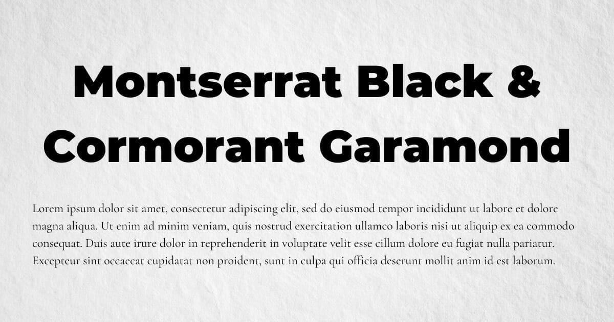
Cormorant Garamond & Montserrat Black
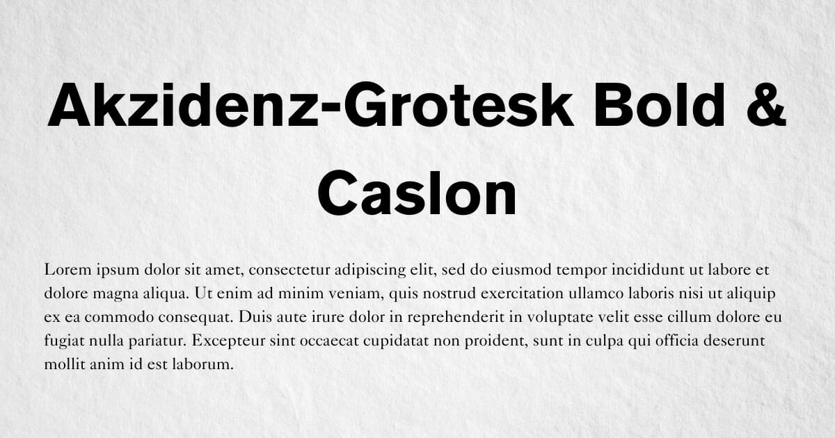
Akzidenz-Grotesk Bold & Caslon
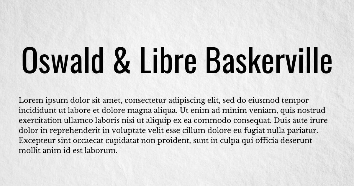
Oswald & Libre Baskerville
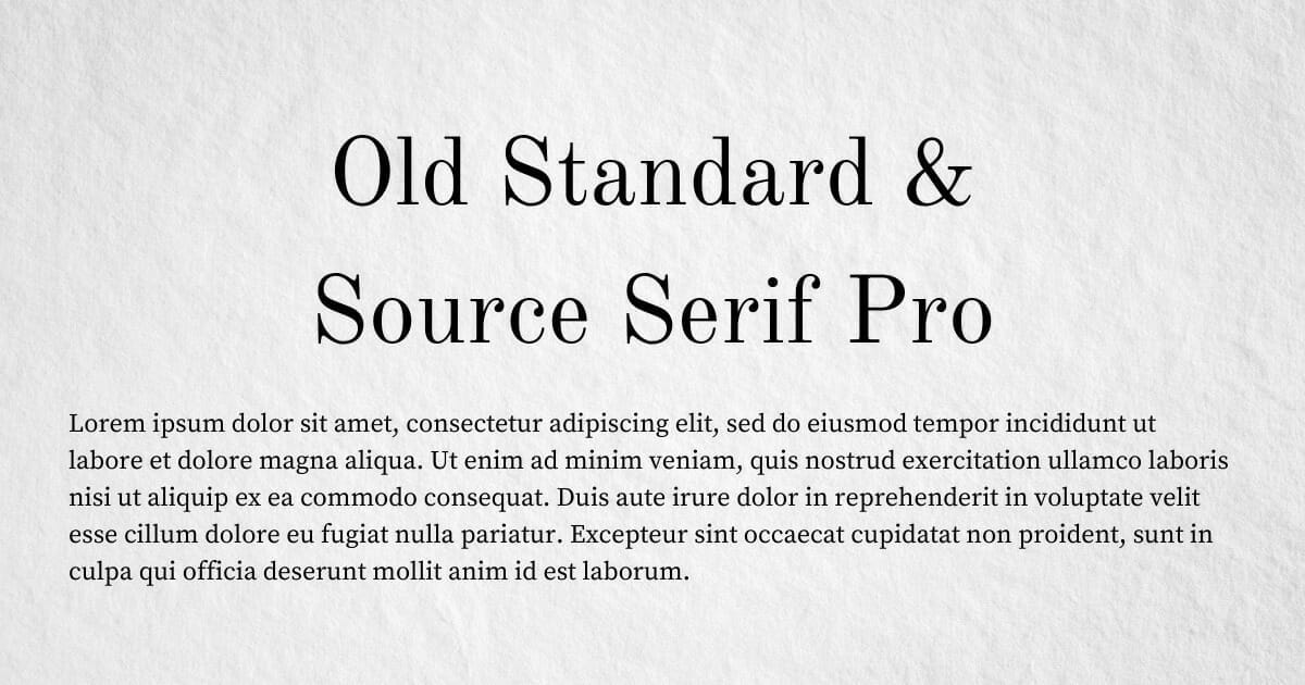
Old Standard & Source Serif Pro
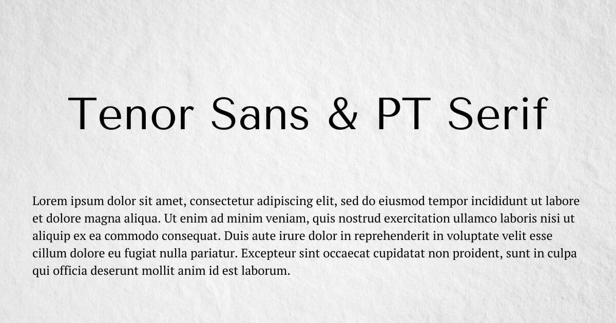
Tenor Sans & PT Serif
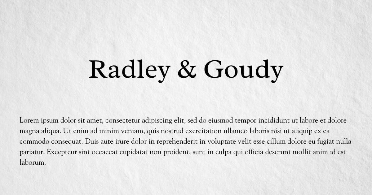
Radley & Goudy
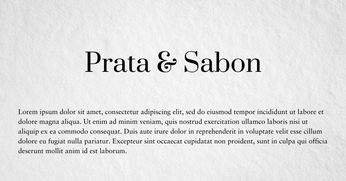
Prata & Sabon
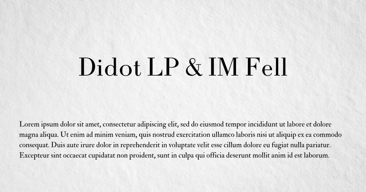
Didot LP & IM Fell
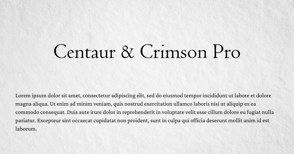
Centaur & Crimson Pro
Using complementary combinations of fonts can give your book pages a dimension, flavor, and harmony they might not have otherwise. Use these combinations as a starting point for your own experiments.
