

Case Study: Quiet Americans: Stories by Erika Dreifus
Design Brief: The author is a short story writer and a contributing editor for The Writer magazine and Fiction Writers Review and an advisory board member for J Journal: New Writing on Justice. Erika’s writing practice encompasses fiction, poetry, and nonfiction. Erika is also the editor/publisher of The Practicing Writer, a free e-newsletter featuring advice, opportunities, and resources on the craft and business of writing for fictionists, poets, and writers of creative nonfiction.
Constraints: Quiet Americans was to be published by Last Light Studio, “an independent, author-friendly cooperative micropress.” Erika originally contacted me to design a cover for the book to help the publication. Eventually I was also asked to design and produce the interior. I was given free rein to create covers and typography that would be suitable for this book of interconnected stories, all based around Holocaust survivors and mostly set in New York City.

Raw Material: Erika’s manuscript was complete, and the cover design was open to inspiration. I spent some time reading the stories, which I can’t recommend highly enough. The tone of the book was very influential in my design process. Many of the stories “reframe familiar questions about what is right and wrong, remembered and repressed, resolved and unending” among characters who try to come to grips with the different worlds they inhabit.
Production Goal: The book was designed from the outset for digital printing and print on demand distribution. It ended up at CreateSpace, who did a fine job on the finished books. Since the manuscript wasn’t that long, we picked a trim size of 5.25″ x 8″ which makes for an intimate reading experience, and I’ve since used this size for several other books.
Challenge: Create an inviting environment for these affecting stories, while leaving the communciation between the author and her readers as direct as possible.
A Refined Reading Experience
Probably the most interesting part of the book interior was the typography, inherited from the cover design. In experimenting with various typefaces to try to find exactly the right tone, I stumbled on a font I hadn’t used in quite a few years, but which seemed oddly perfect for Erika’s book: Bell Gothic.
You might wonder why it’s called Bell Gothic, but here’s the secret: this typeface was designed for use in phone books, to be legible at very small sizes. When enlarged to the size of the chapter titles it reveals strange and interesting letterforms that you can’t really appreciate when it’s small. Erika approved the design and here’s how it looks:
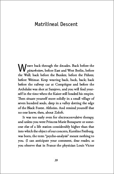
For the body of the book, Adobe Garamond Pro once again created a smooth and flowing reading experience:
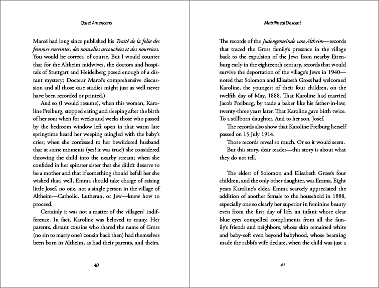
Using drop folios (page numbers at the bottom of the page) allows you to put a few less lines on each page, thereby expanding the page count of the book. It works well here.
Book Cover Design
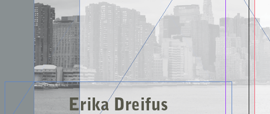
I spent a lot more time on the cover, going through various designs to find one that perfectly suited the book. I kept coming back to images of the city, and then found this image on Flickr.com:

Although this photo of the New York skyline was not impressive in itself, there was something about the tone of the picture and the viewpoint from which it was taken that grabbed me. Through a process of many trials, I finally hit on a way to impart the exact flavor I was looking for. By layering the photo with layers of white and a slate gray color, then manipulating the blending modes and opacities of the various layers, I got the effect I was looking for. Here’s a detail of the layered elements:

Just a touch of red in the title set off the whole cover, and the final version really represents the book well:
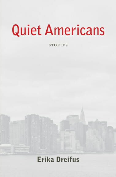
Due to the delicate nature of the tones on this cover, I was a little concerned that the printing wouldn’t stay in balance. With delicate grays, any variation in ink or toner density can have the result of a radical color shift. In an early printing, the cover did go in the wrong direction, but the printer corrected this error, and the cover is now a reliable and accurate representation of the design.
Conclusion
This project was very satisfying to work on. I loved Erika’s stories, and she was open to any design approaches I suggested. Although Quiet Americans was not a self-publishing project, the author was able to get completely involved in the design outcome of her book. Publication date is January 19 (but it’s is available now), and the book has already started to draw support: it’s featured as a recommended book in the Jewish Book Council’s weekly e-newsletter.
Data
Buy Quiet Americans on Amazon
Erika Dreifus’ author website
ISBN: 978-0982708422
Size: 5.25″ x 8″, 164 pages
Price: $13.95
Typography, book layout and graphics in Adobe InDesign and Photoshop.
Typeset in Adobe Garamond Pro, Bell Gothic and Myriad Pro
Digital printing by CreateSpace
All Amazon and CreateSpace links are affiliate links. Thank you for your support.
